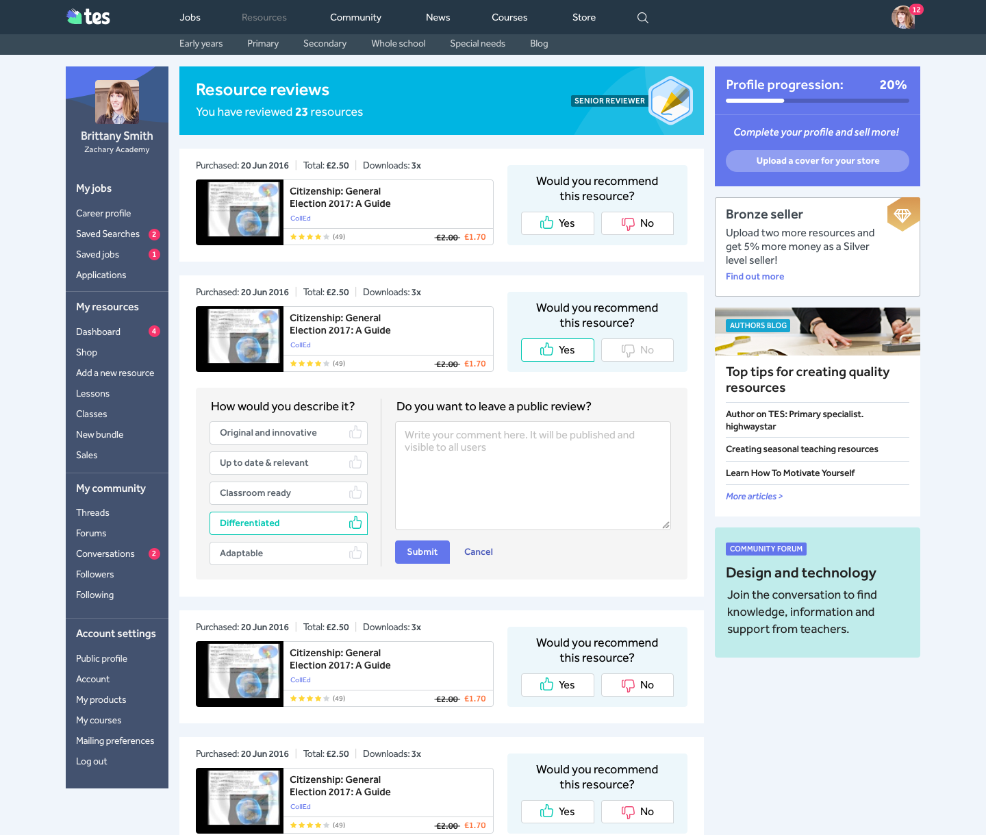
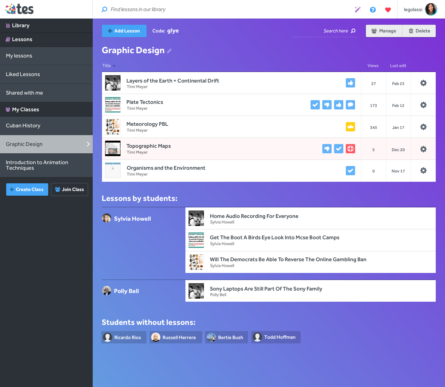
My work
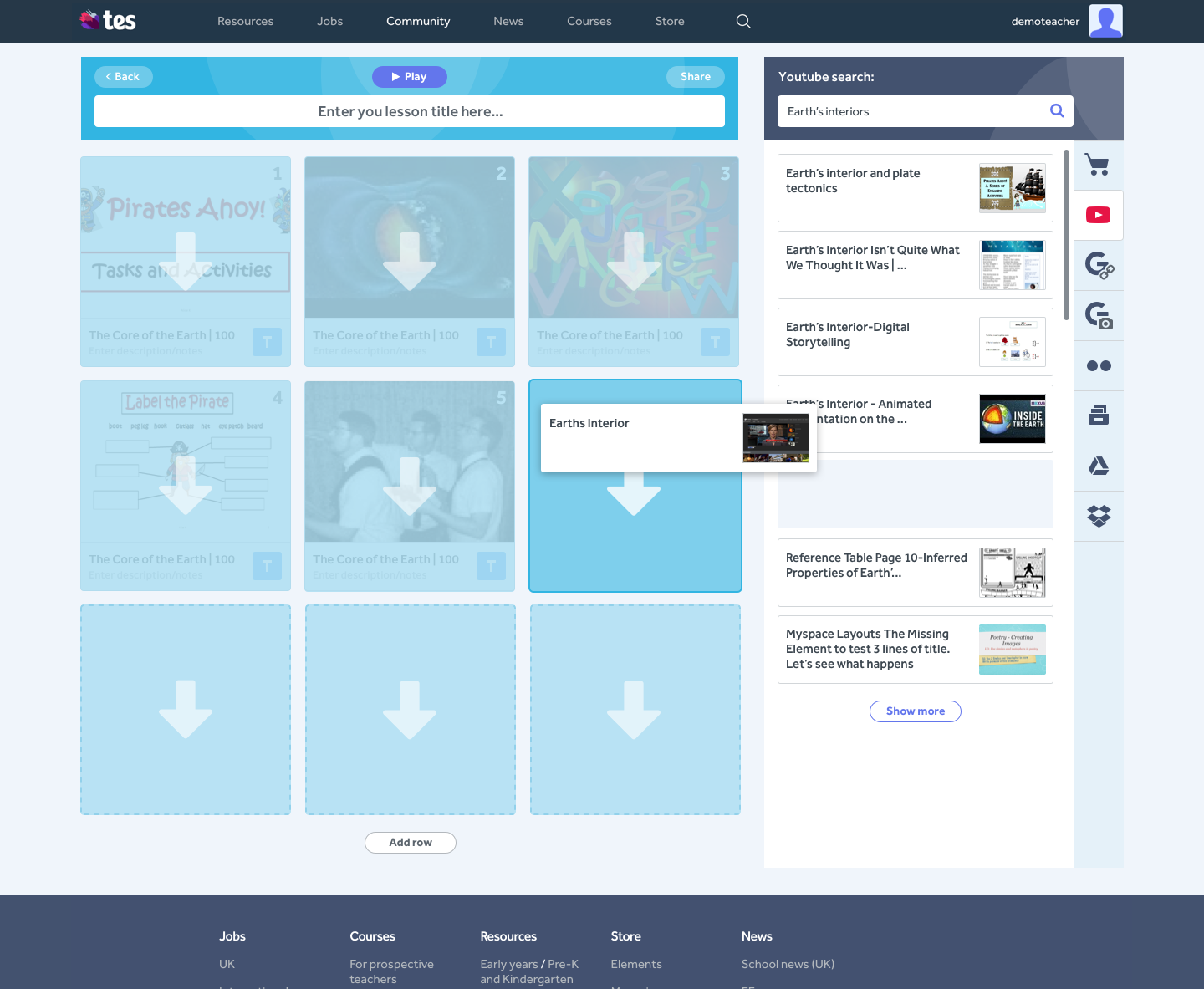
Tes Teach (iPad)
My role: Only Product Designer
Rest of the team (11 total):
- 1 Product Manager
- 8 Engineers (3 in-house, 5 contractors)
- 2 Marketers
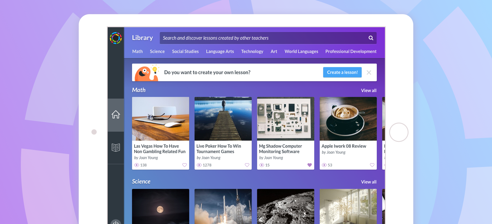
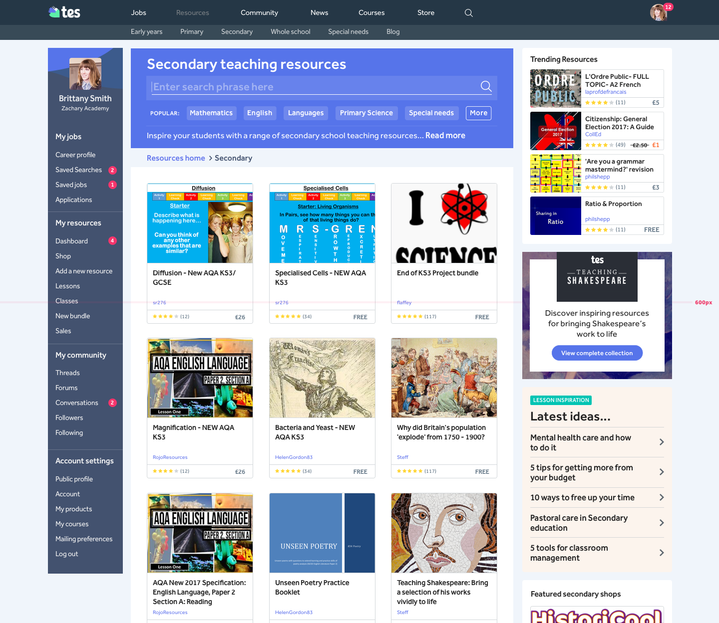
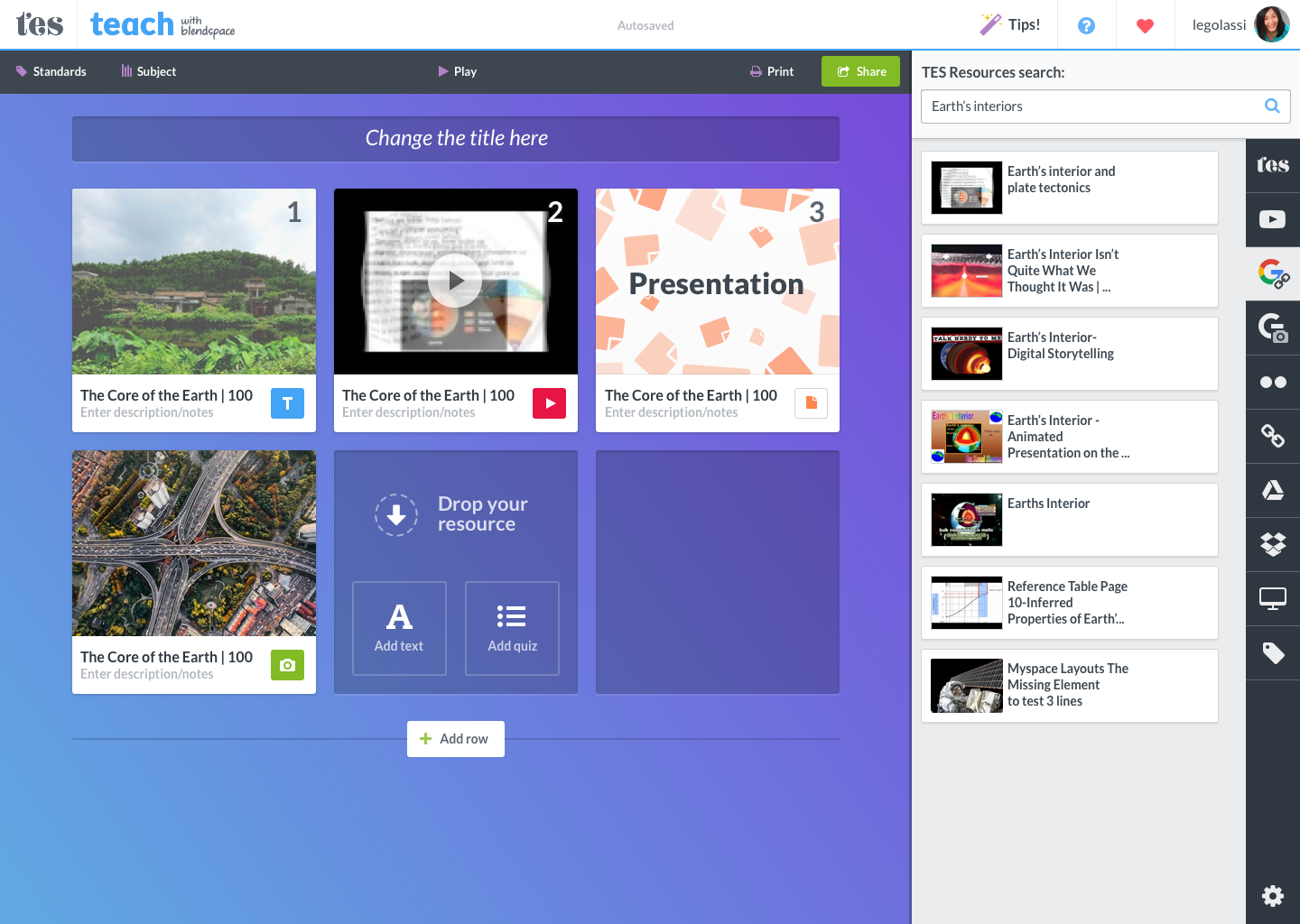
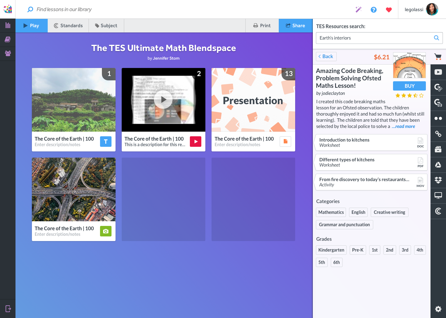
Tes Teach is used by millions of teachers and students around the world to create, build and share interactive lessons with students and teachers. With the increasing numbers of iPads in the classroom, we decided to build an iPad app to enhance and complement the current Tes Teach web experience.
Defining the problem
With the popularity of Blendspace in the US, Tes decided to use it as a way to introduce their brand into the American market and let teachers know about their other products. With more and more students using iPads in the classroom, we decided to create an iPad app to enhance the Tes Teach web experience and improve the content consumption in the classroom.
My main problems to solve:
- How to design an experience that prioritizes content consumption and still complements the web experience?
- Which features from the web experience should be included in the iPad app?
The main constraints were:
- Time - We had 5 months to build and launch the app before the new school year
- Technology - Not only the normal constraints that a mobile device like an iPad has but also the decision made by the engineering team of using React-Native.
- Consistency - Make the iPad experience to feel like a complement of the web experience.
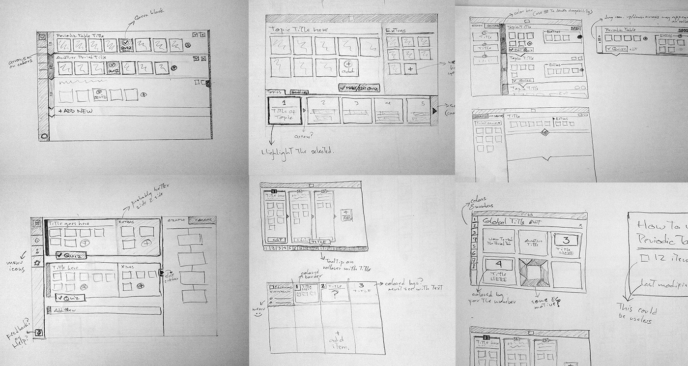
Research, Strategy and UX
I visited schools, interviewed teachers, and observed classes on how they used Tes Teach in their classroom.
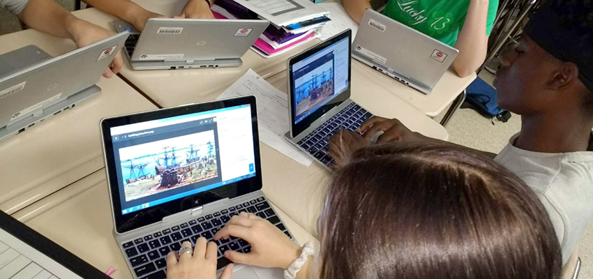
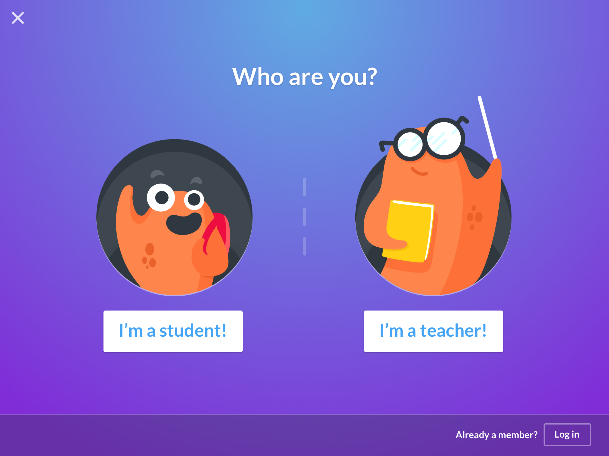
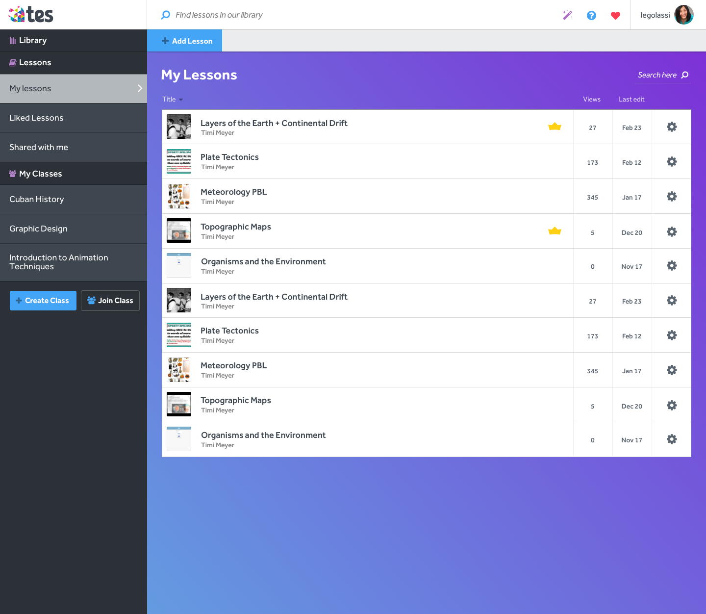
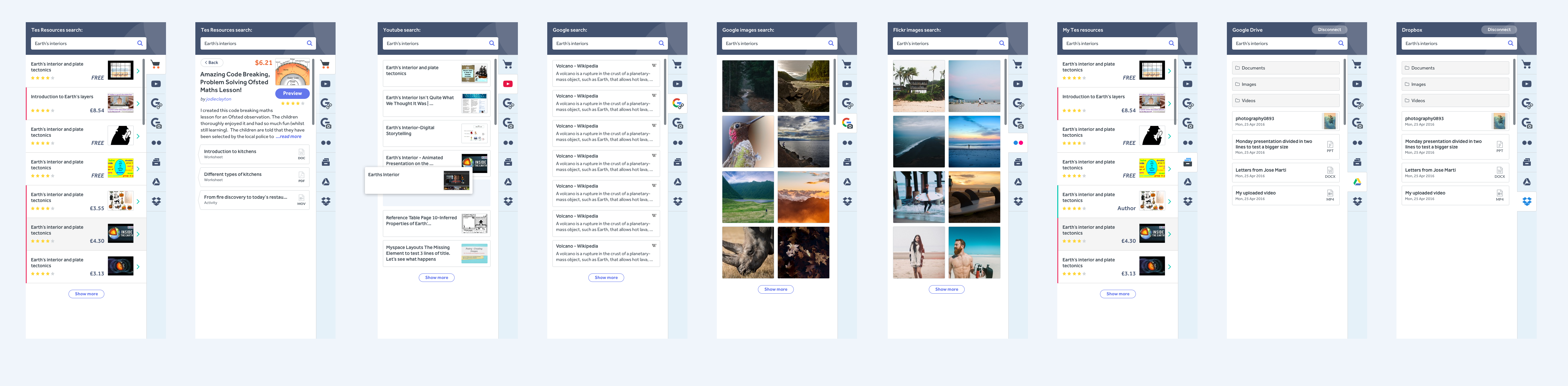
Our user base was basically the same that was defined for our web experience. The big change was to focus on content consumption rather than creation. I found out teachers check their iPads mostly while they’re in the school working with their students or while they’re commuting. That’s why I decided to reduce the number of features for the app to focus more on consumption and discovery of lessons.
Flow
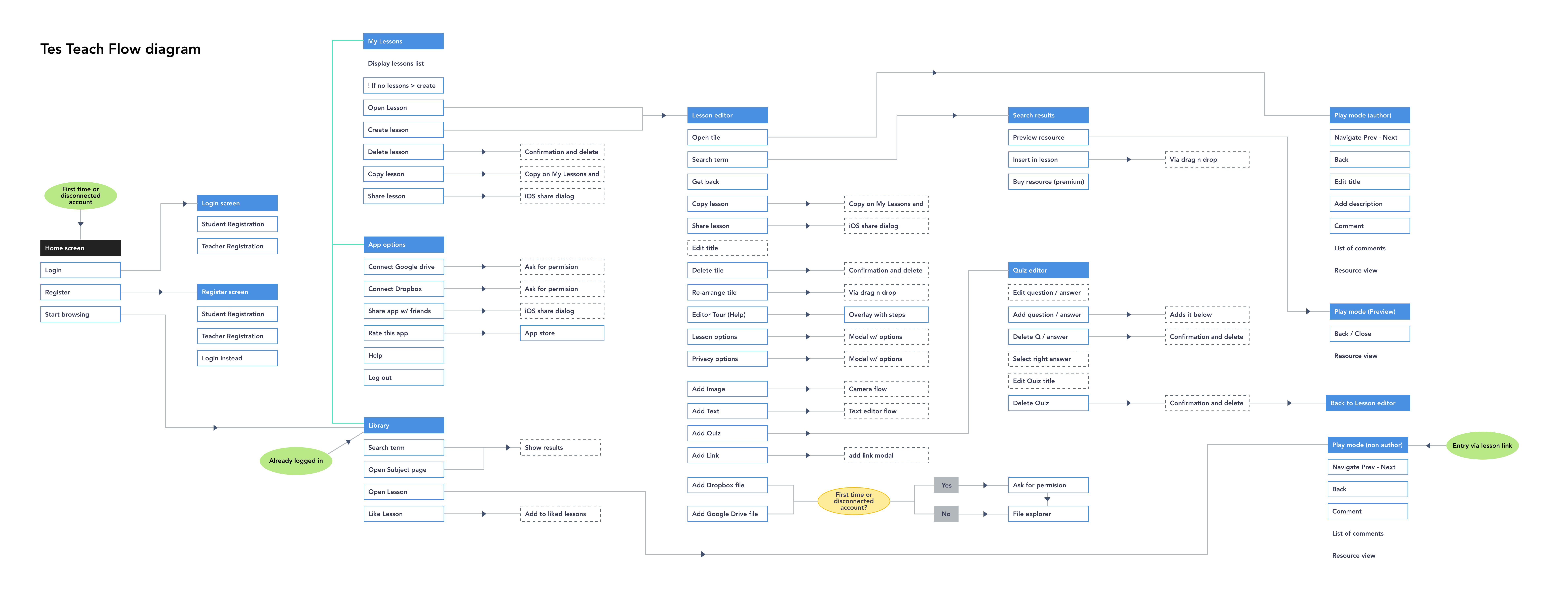
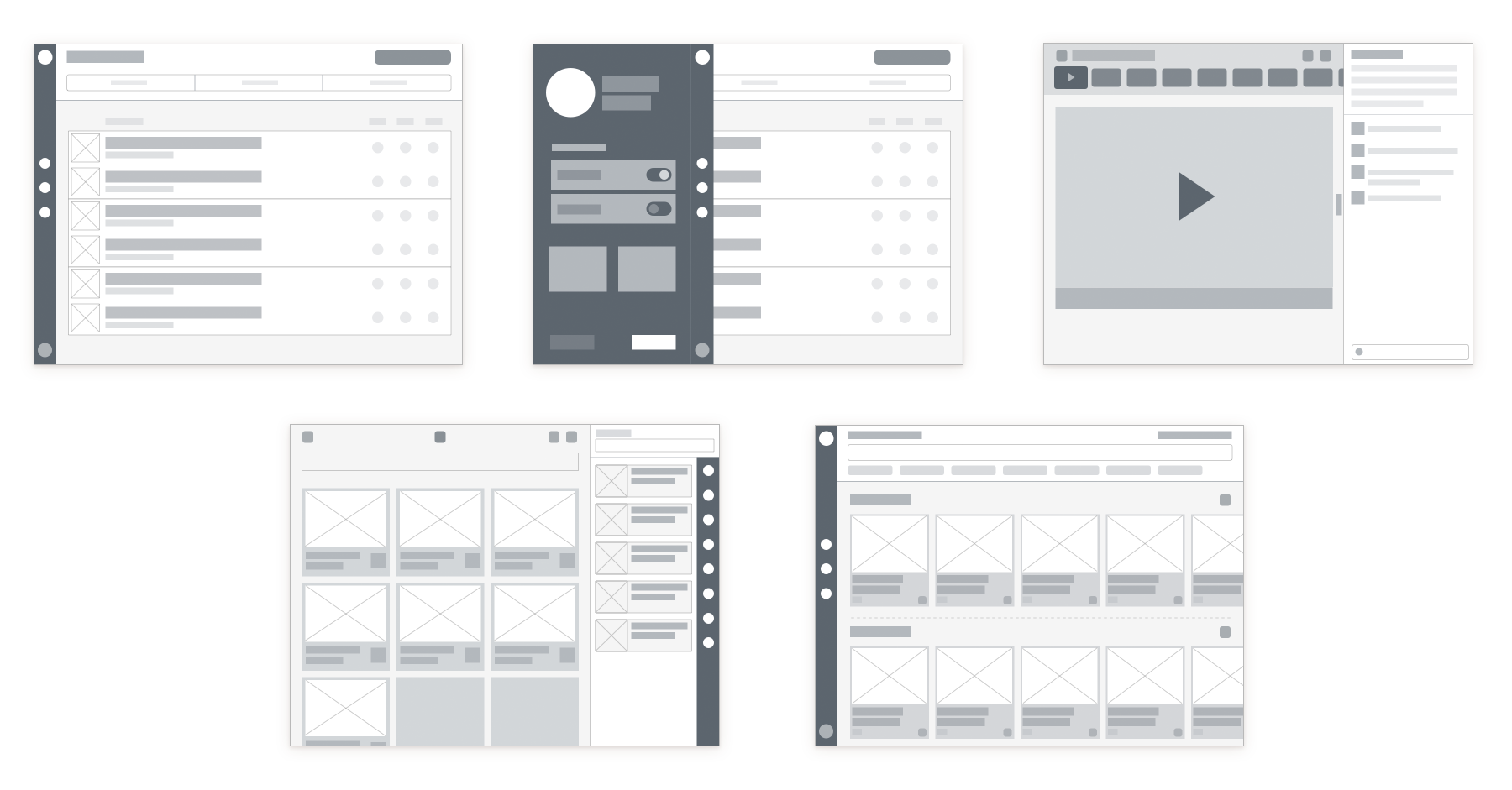
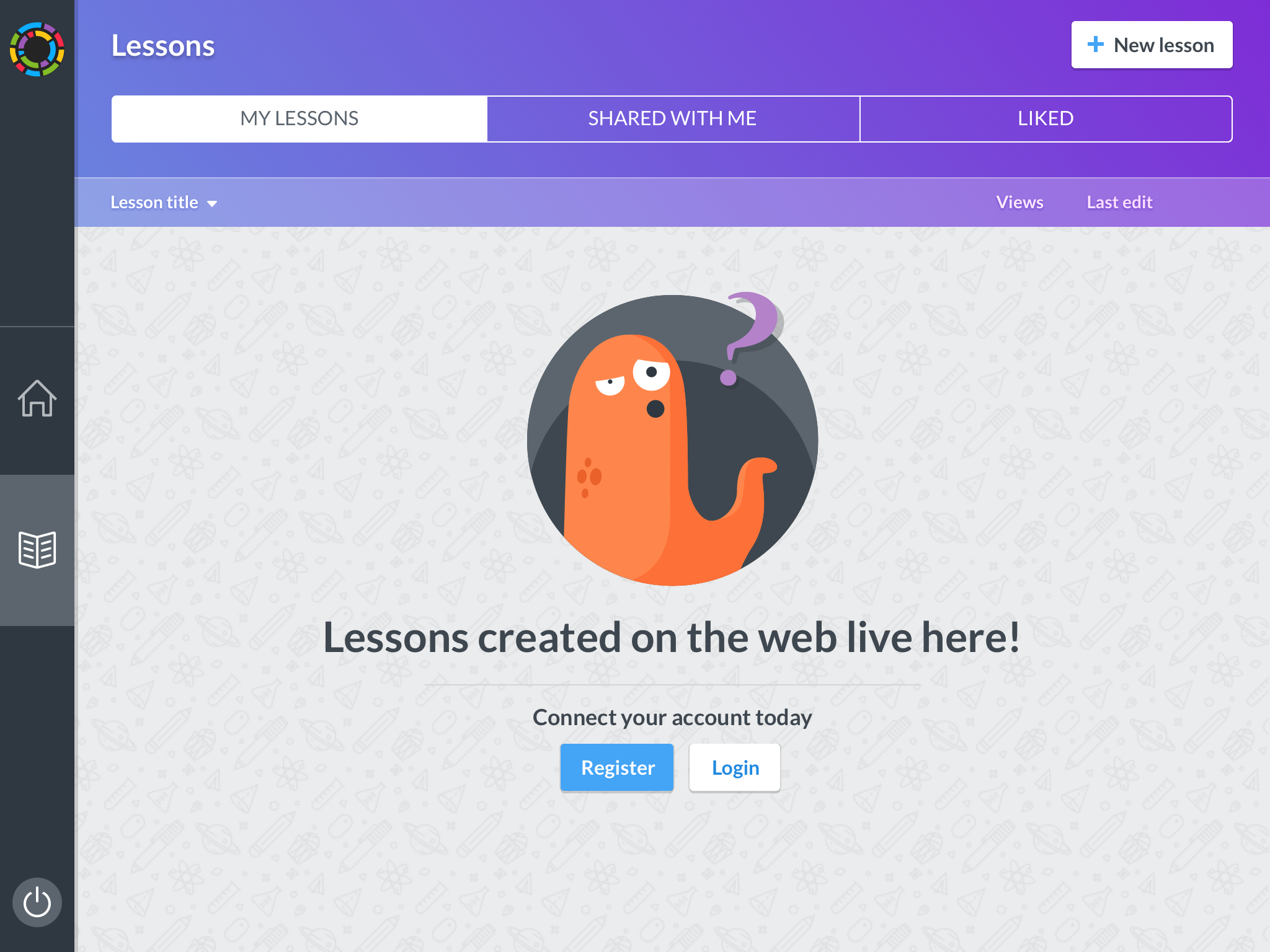
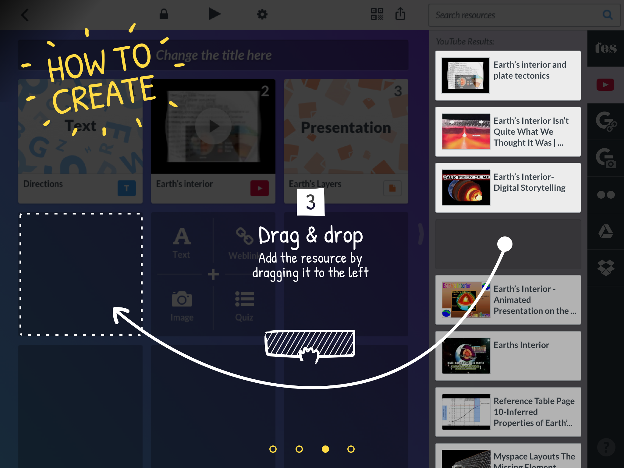
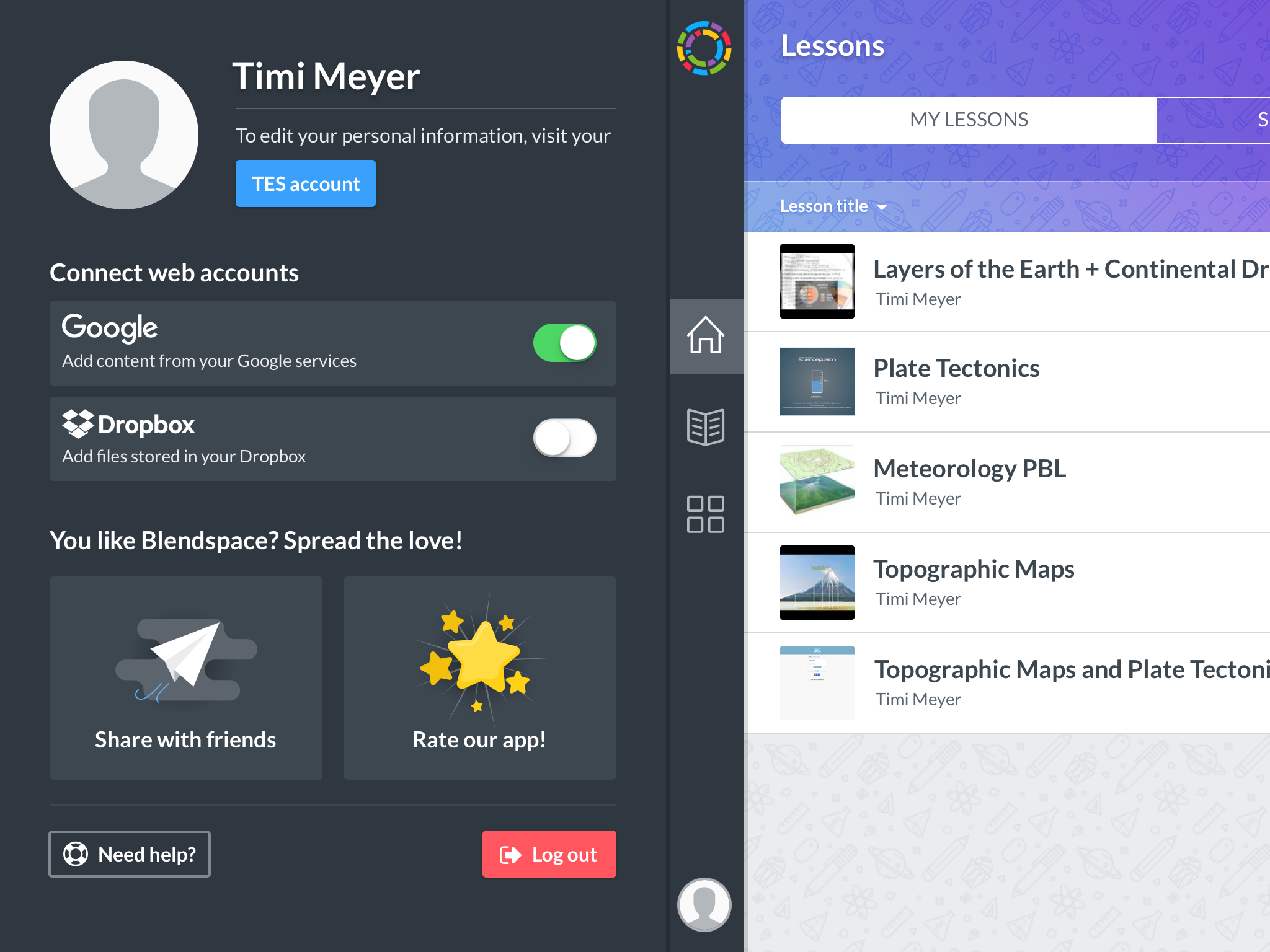
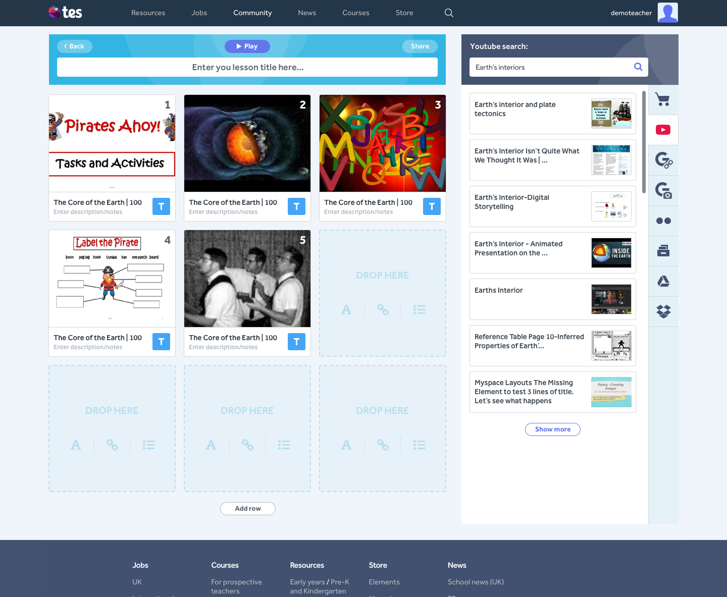
The new flow for the app would start with the lesson library to facilitate lesson discovery and consumption.
Right after, I created wireframes and tested them with 8 teachers. 5 of them current users and 3 completely new to Tes Teach. The feedback was positive. I worked to fix some details and prepared for design
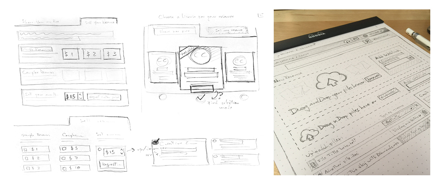
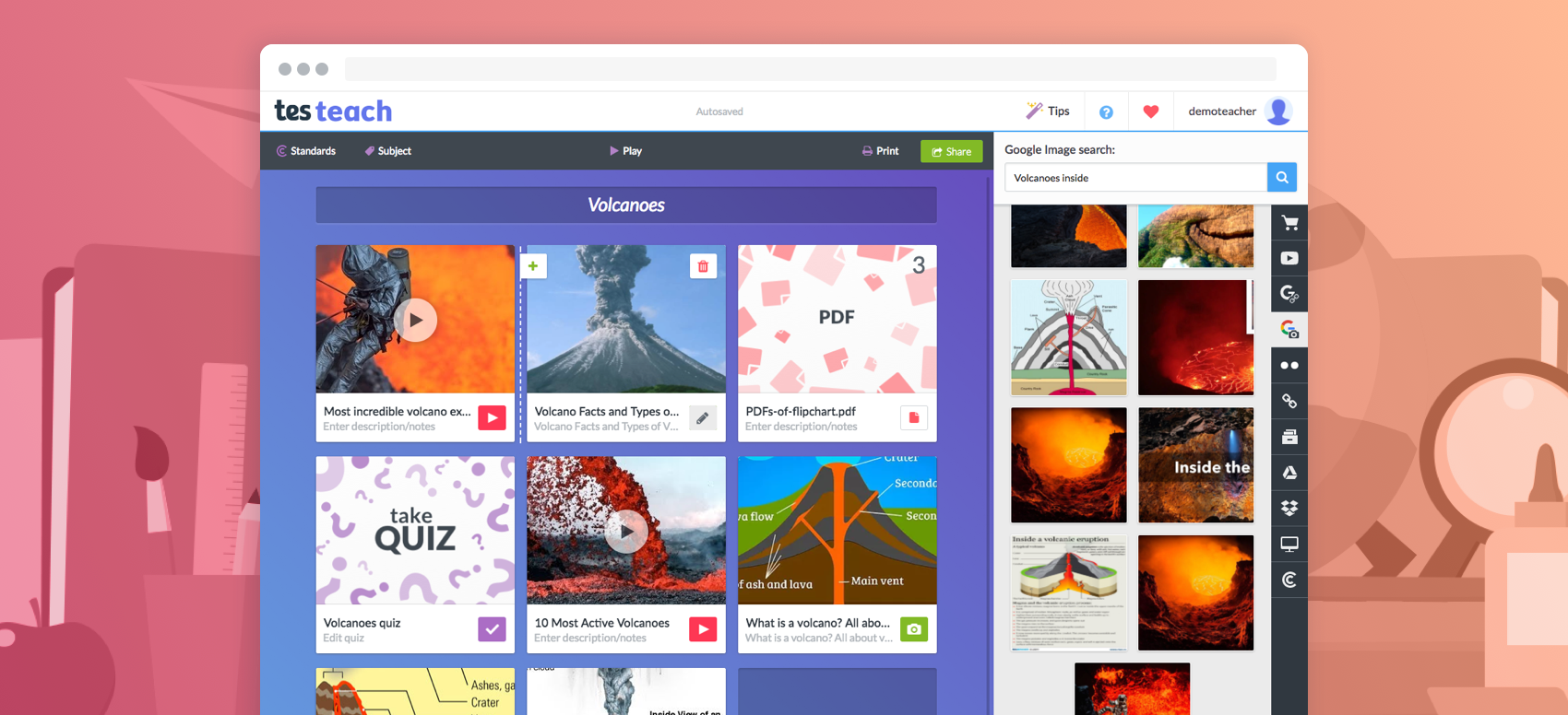
Design / Prototype
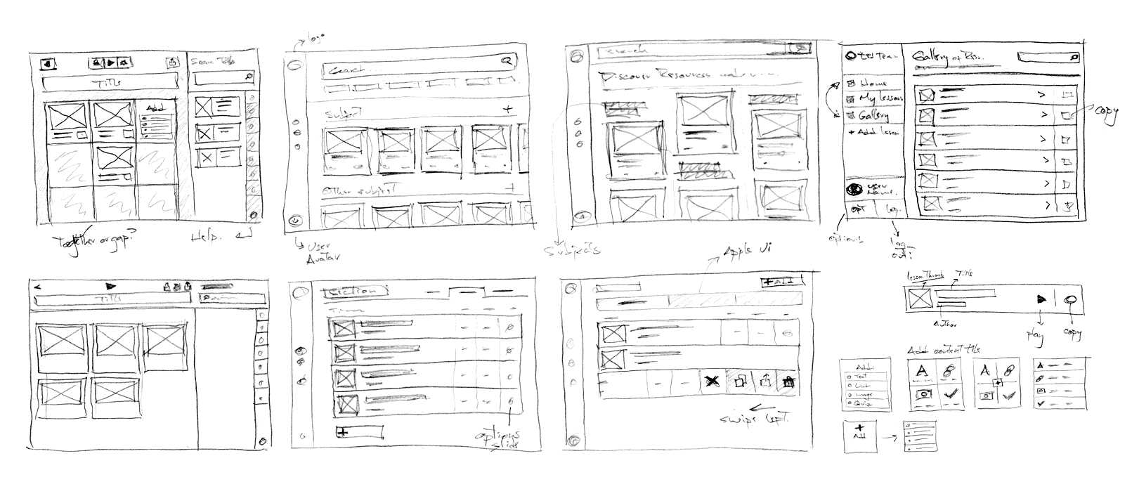
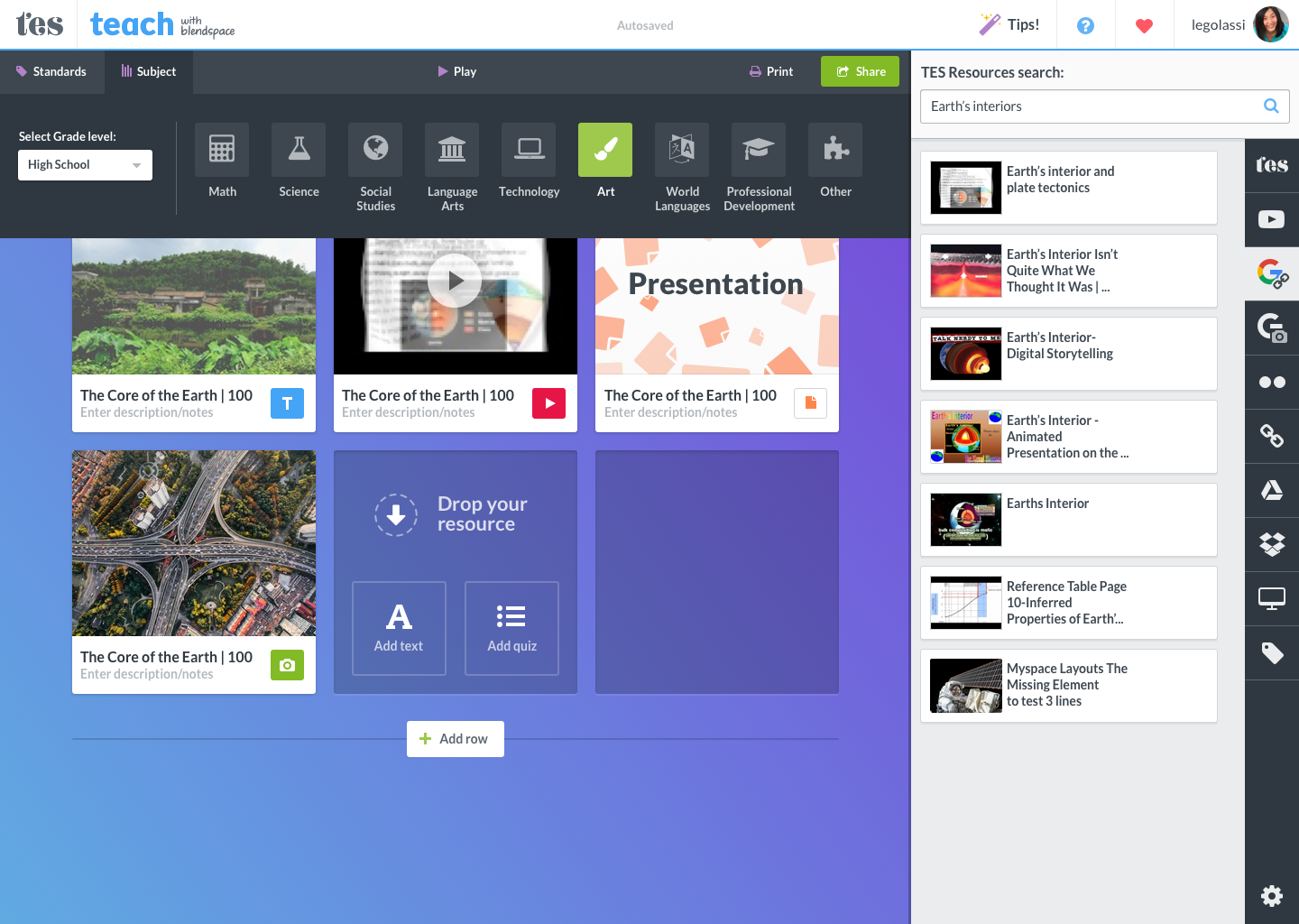
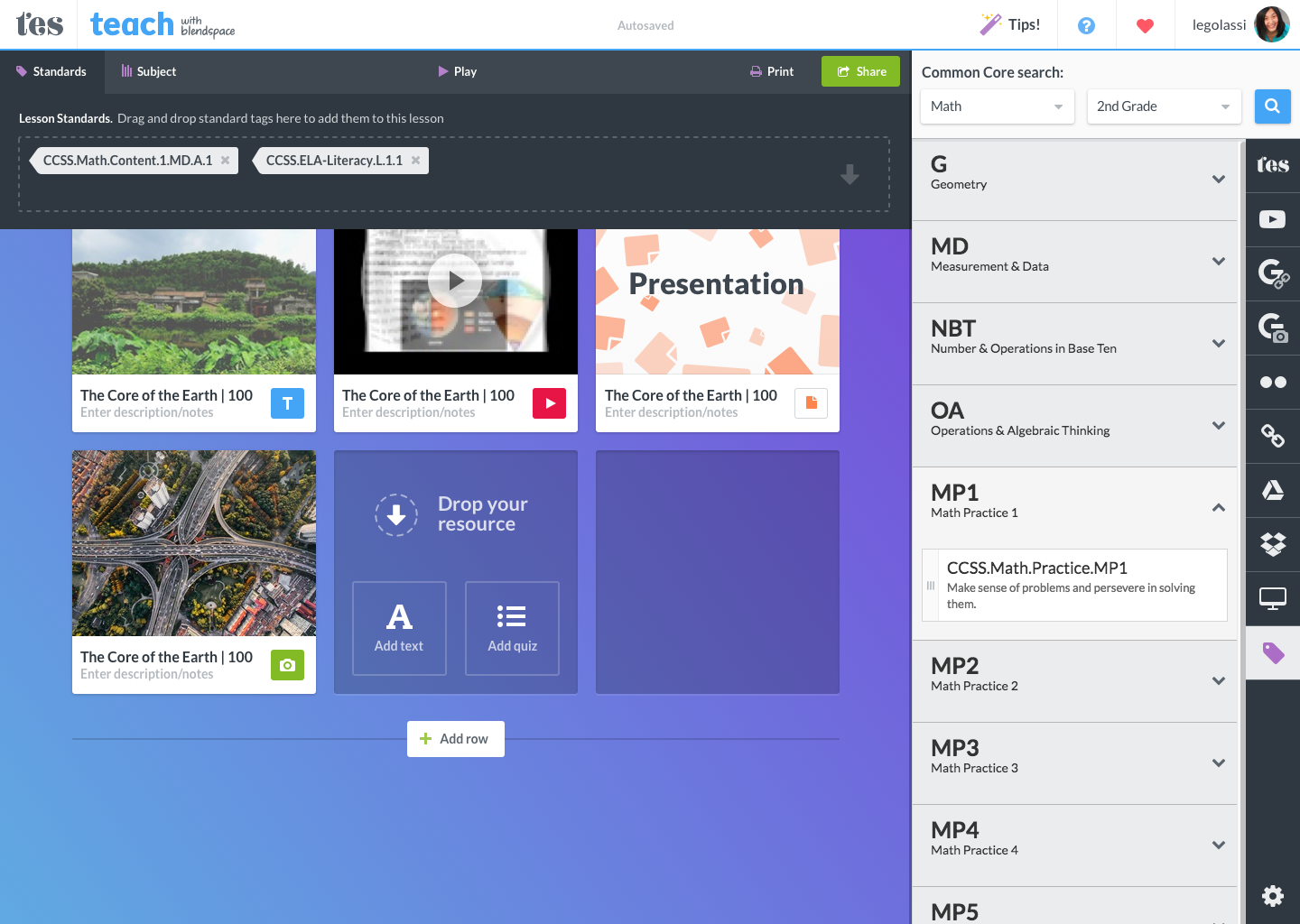
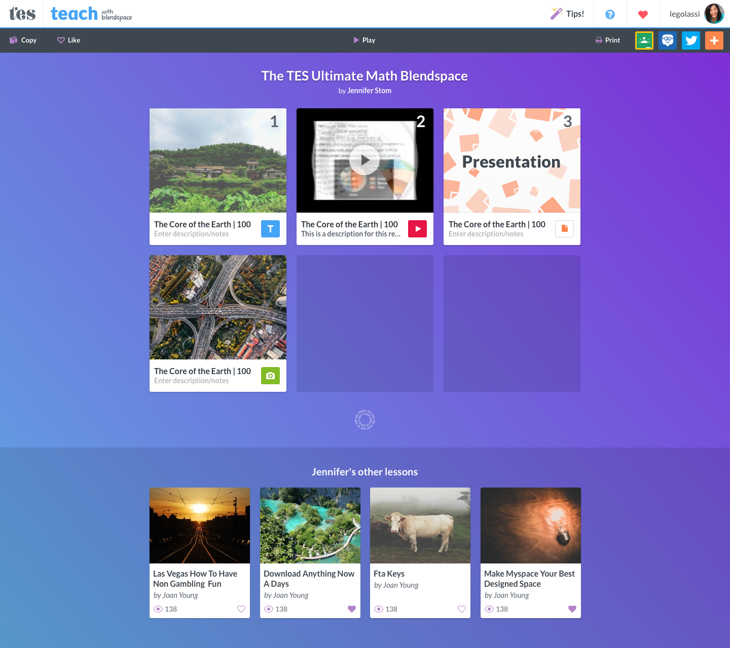
I decided to keep consistency with the visual styles from the web experience (Link) since it proved to be effective. The new challenge was to introduce visual elements from the iOS style guide and blend them with our UI. Using the system’s icons and visual metaphors help users get familiar with the app faster.
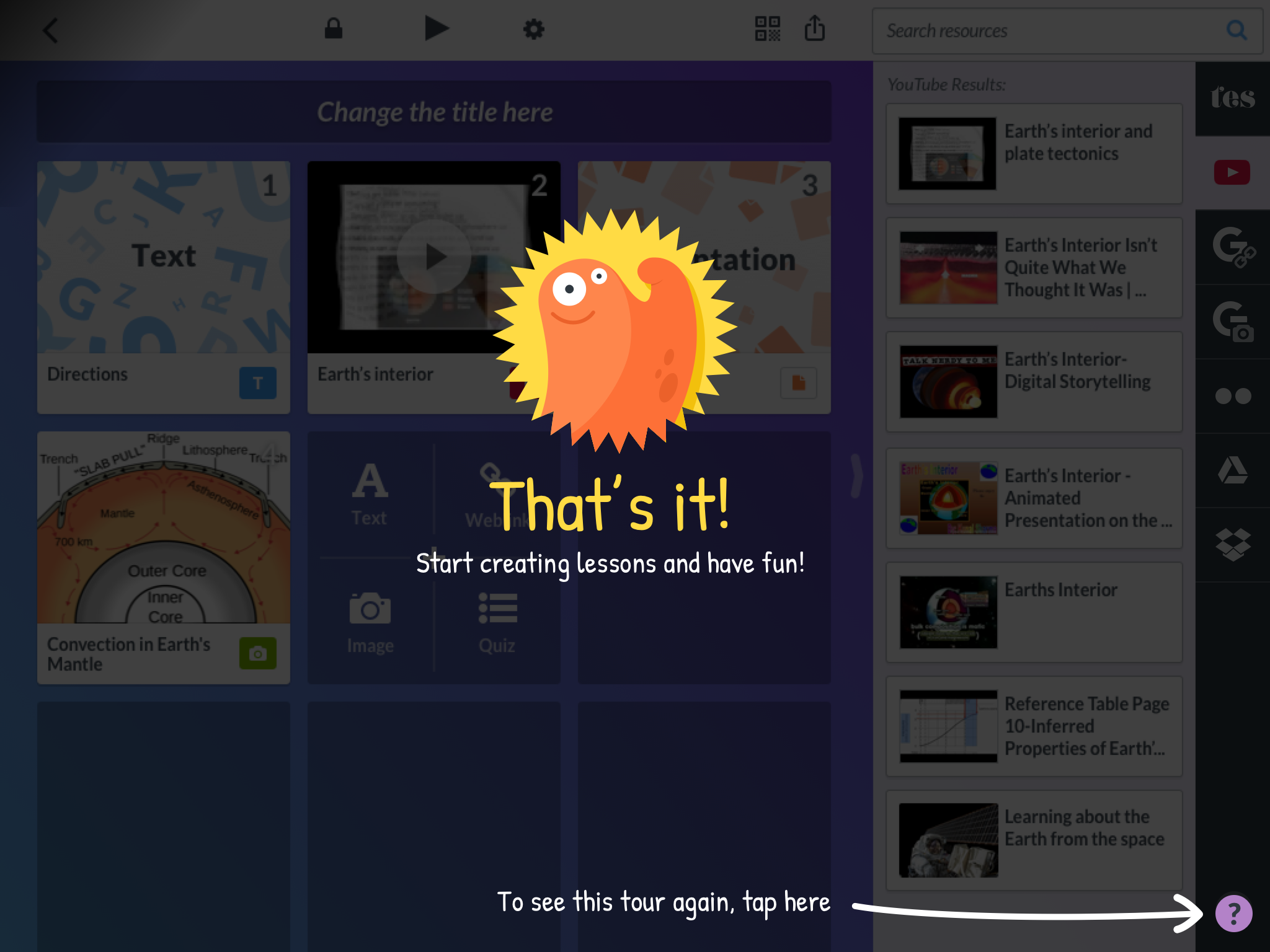
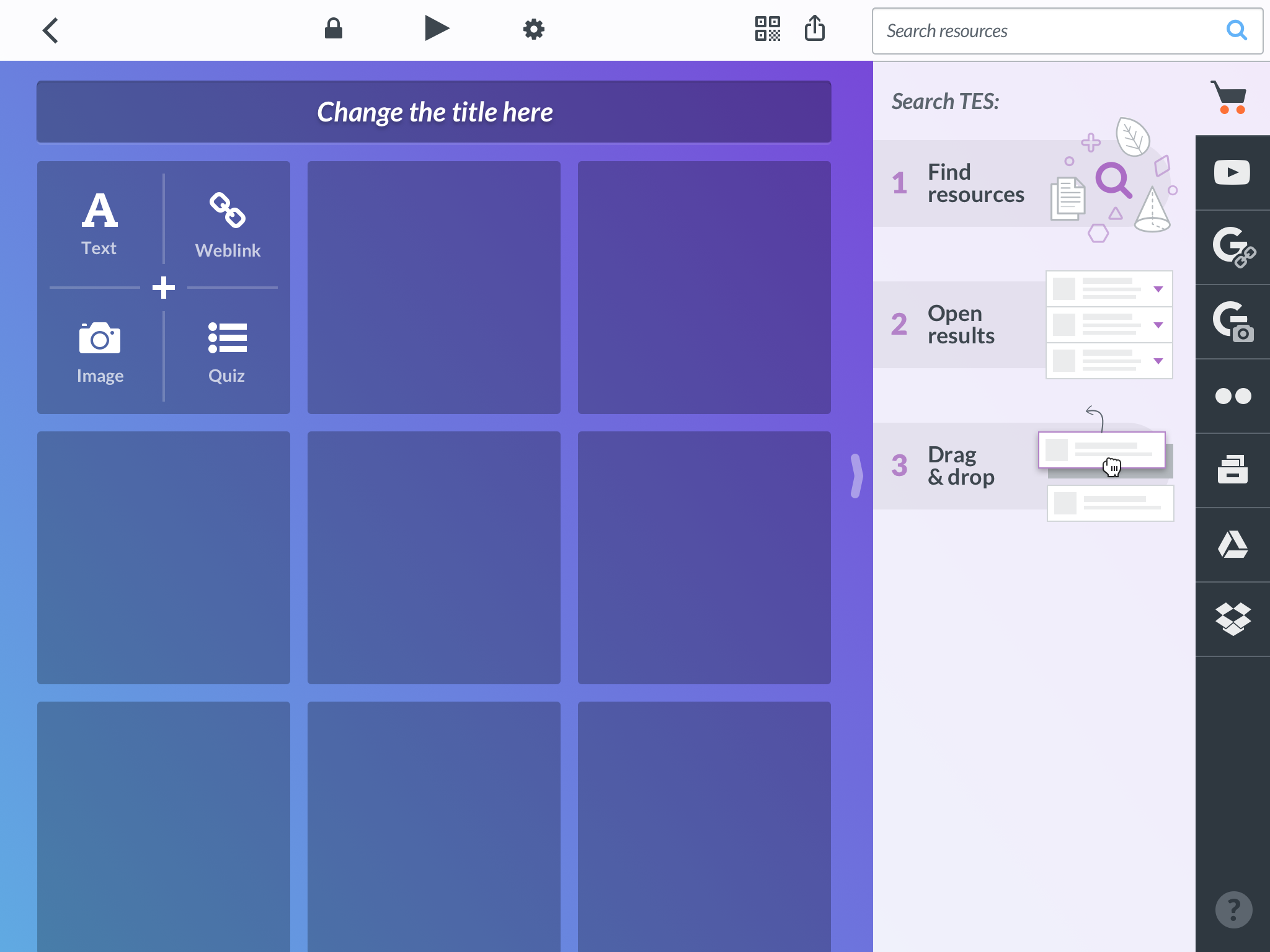
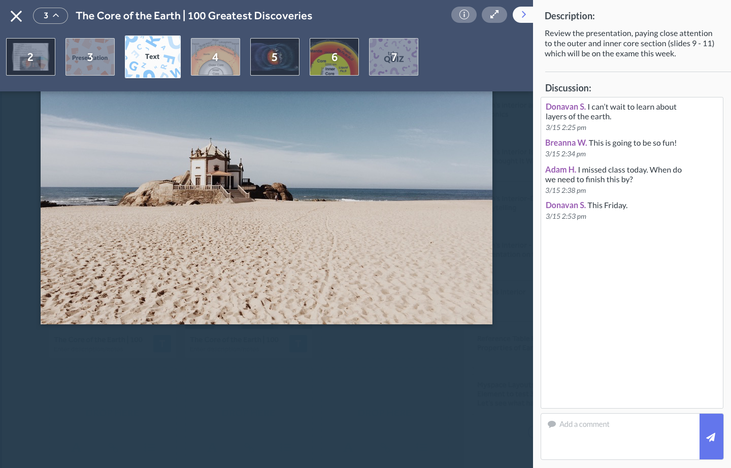
Lesson editor
A big challenge was to translate the lesson creation experience to the iPad. Without hover states and having draggable elements on scrollable areas I had to find solutions that would keep a good experience. I created many different options to handle, create and delete tiles and after testing them later with our beta users I selected the solutions that performed better. The constraint of using React Native prevented us from using many of the solutions due to what the technology supported.
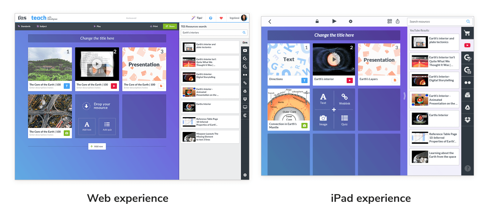
This was one of the biggest challenges because of the differences between doing drag & drop on an iPad and a regular computer and the lack of a hover state on the iPad. Together with the engineers we figured out the right timing for recognizing when the user wanted to drag vs scrolling search results.
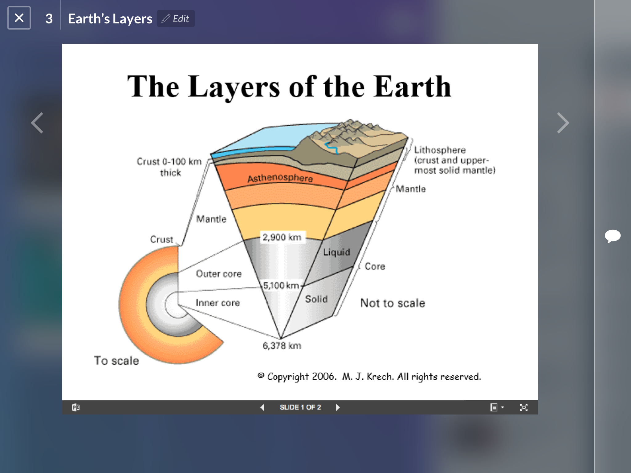
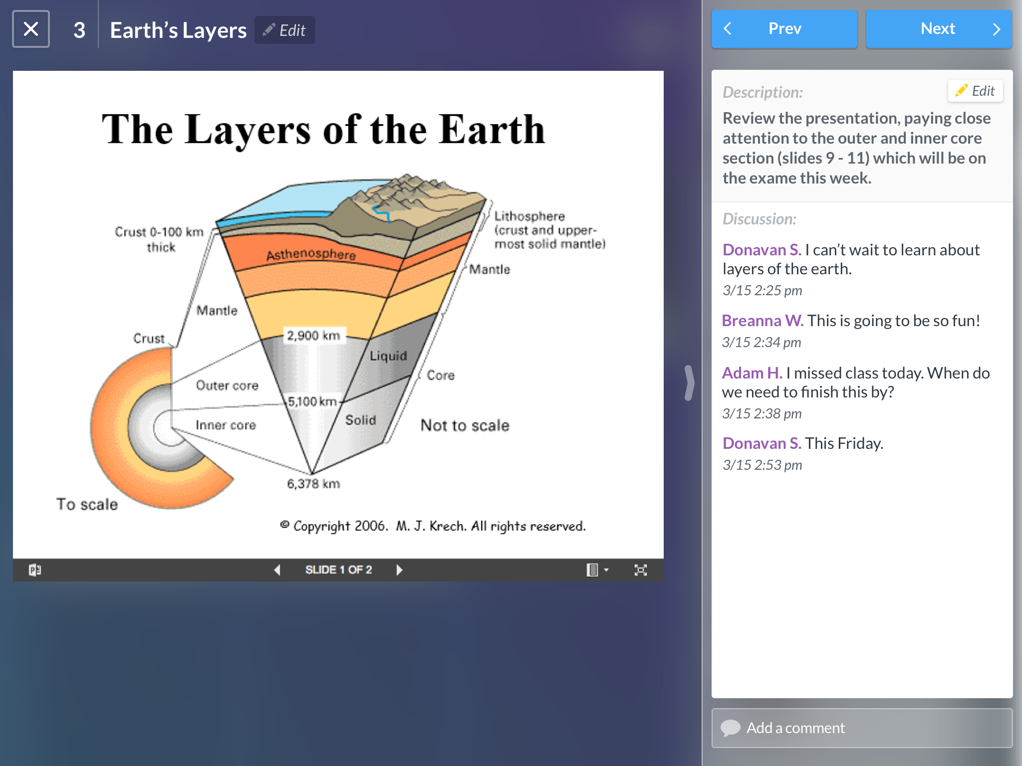
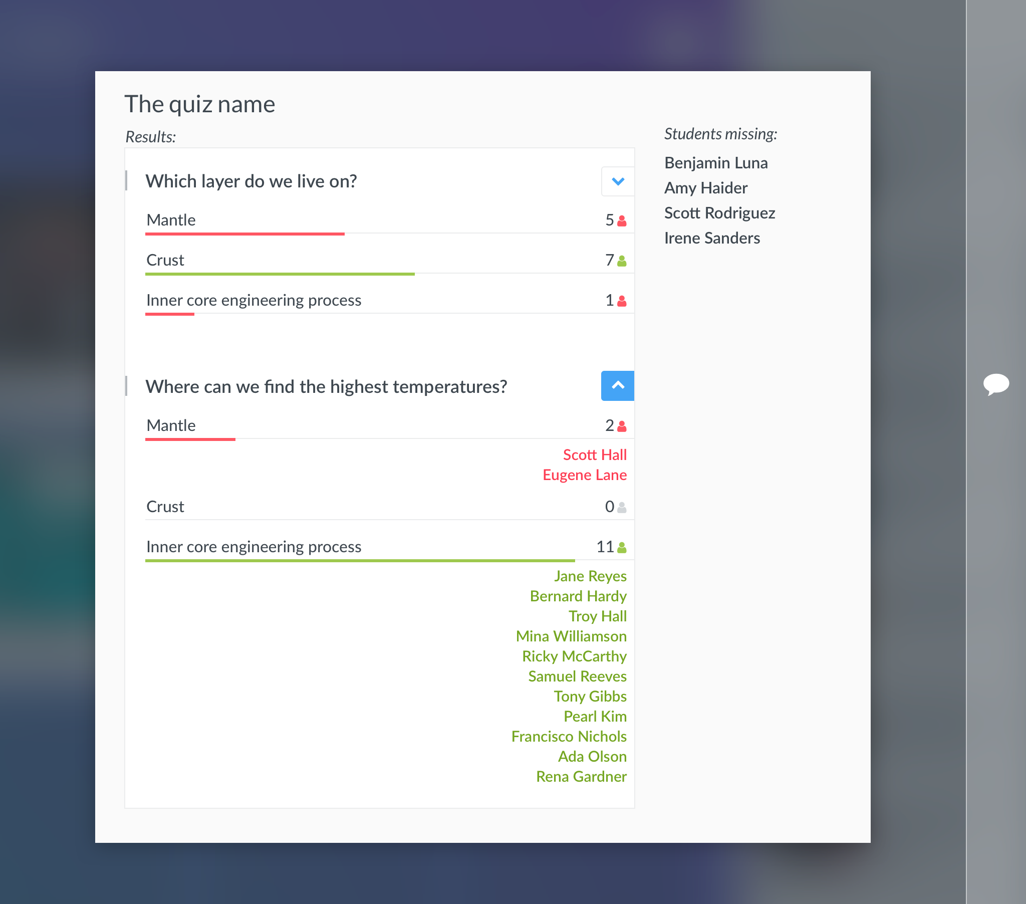
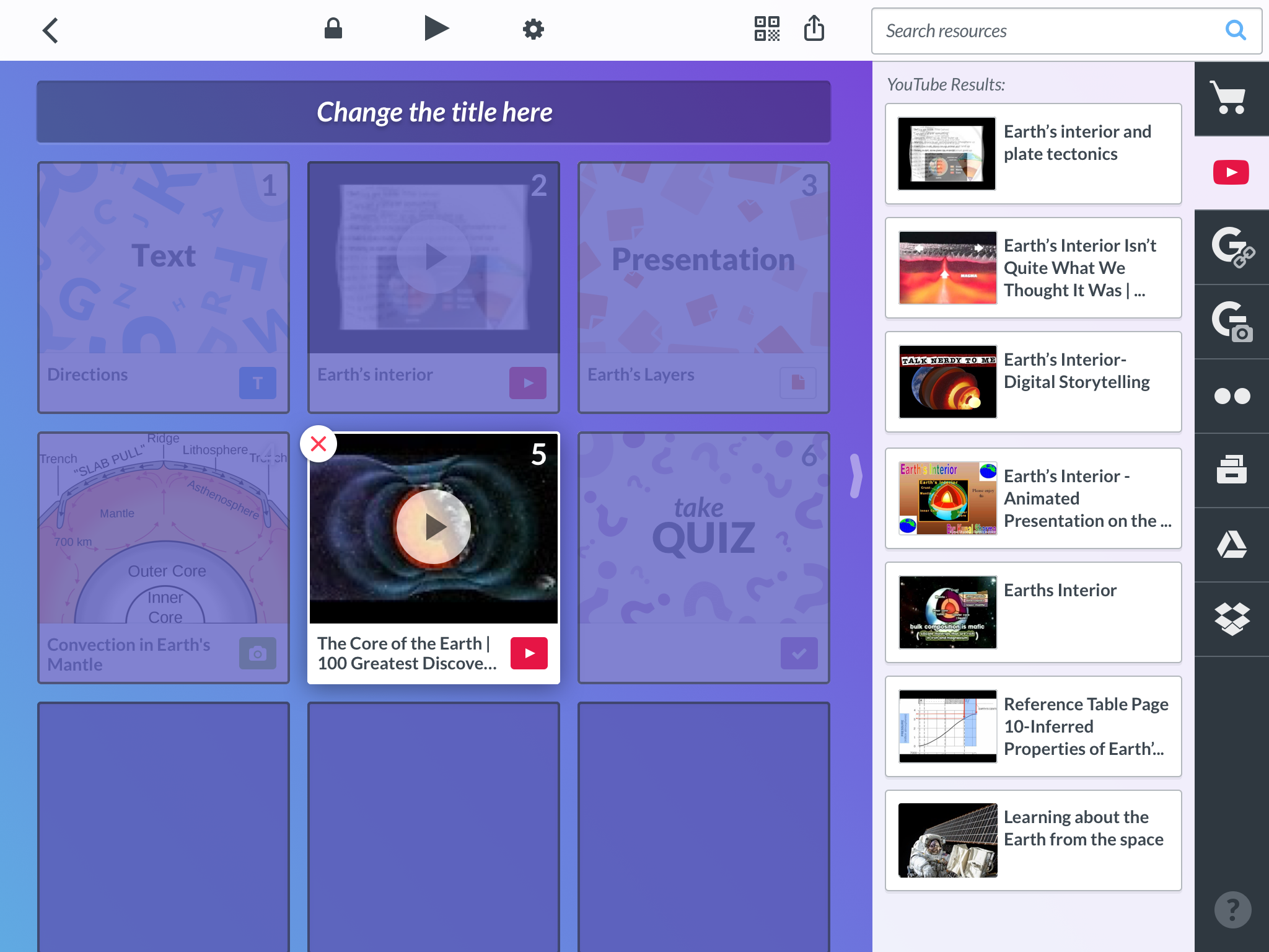
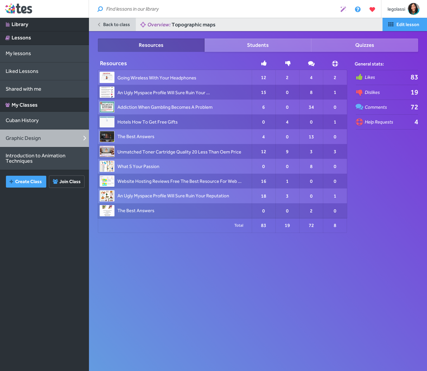
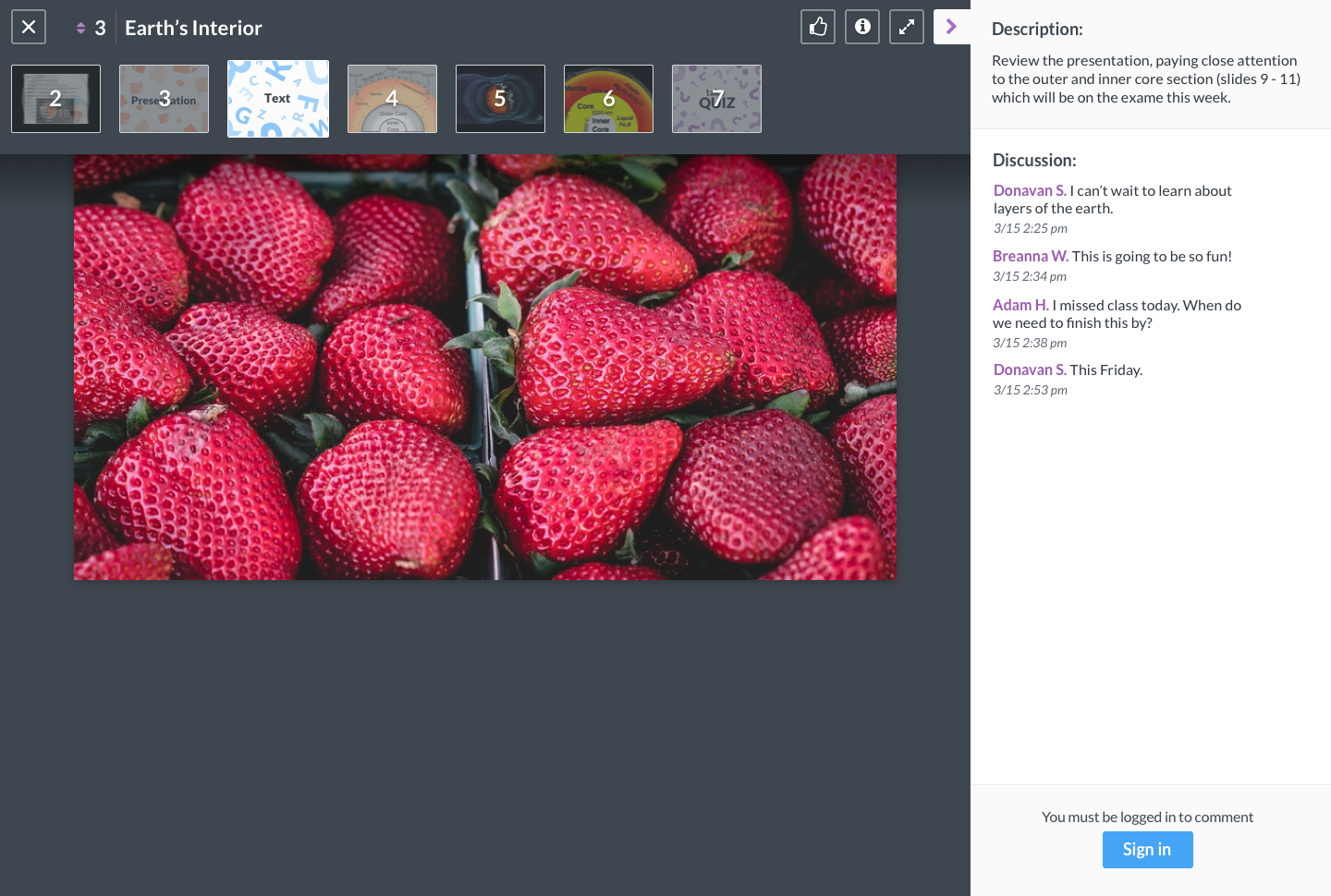
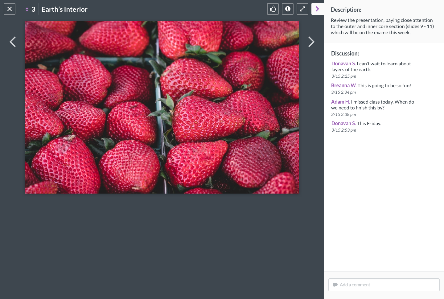
Play mode
When students and teachers open a tile, they get go to “play mode” with a bigger view of the resource and less distractions. The lesson author is the only one who can edit the description.
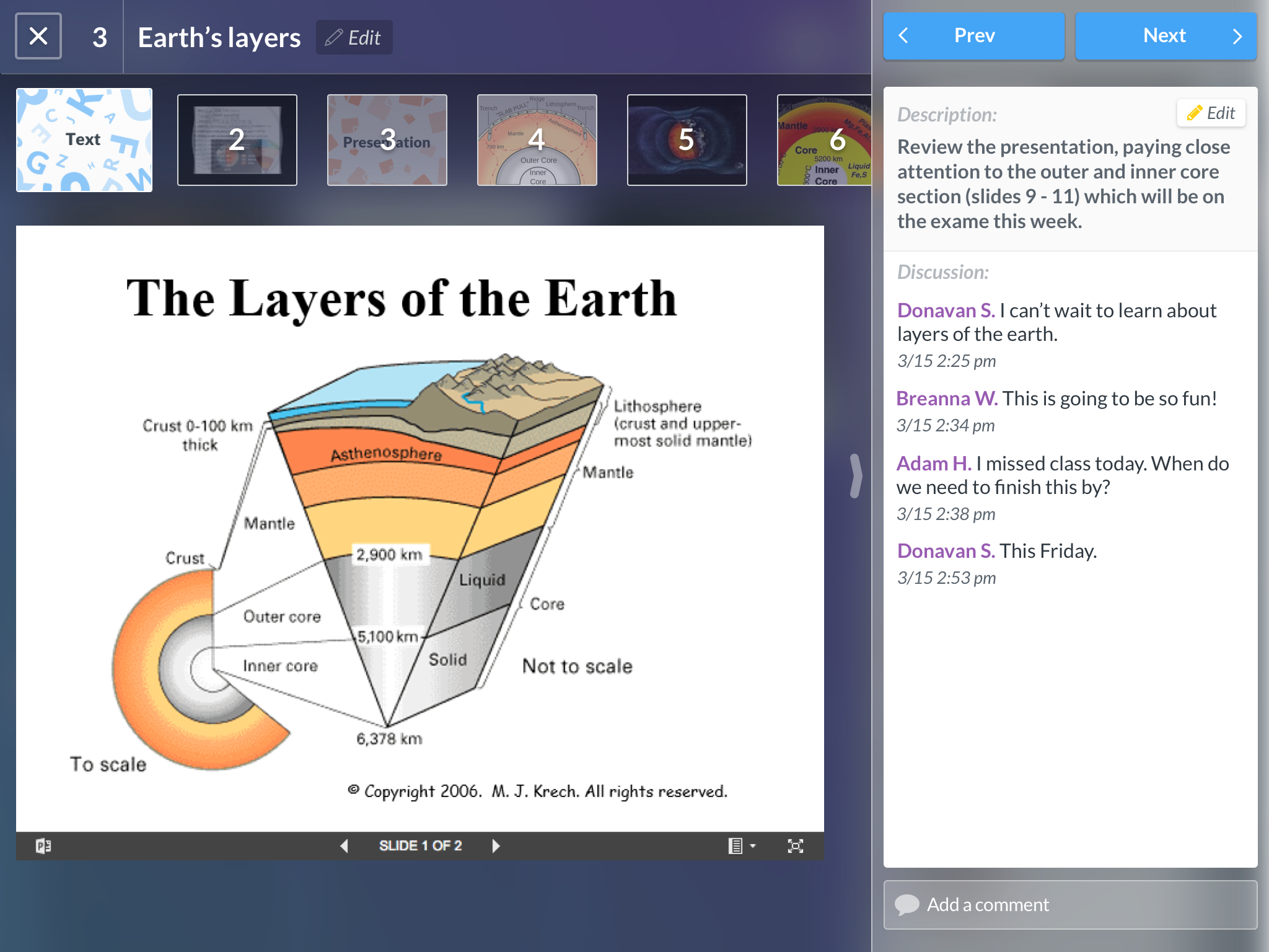
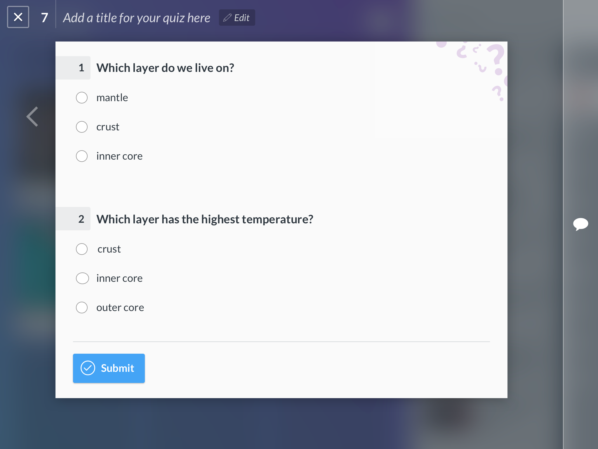
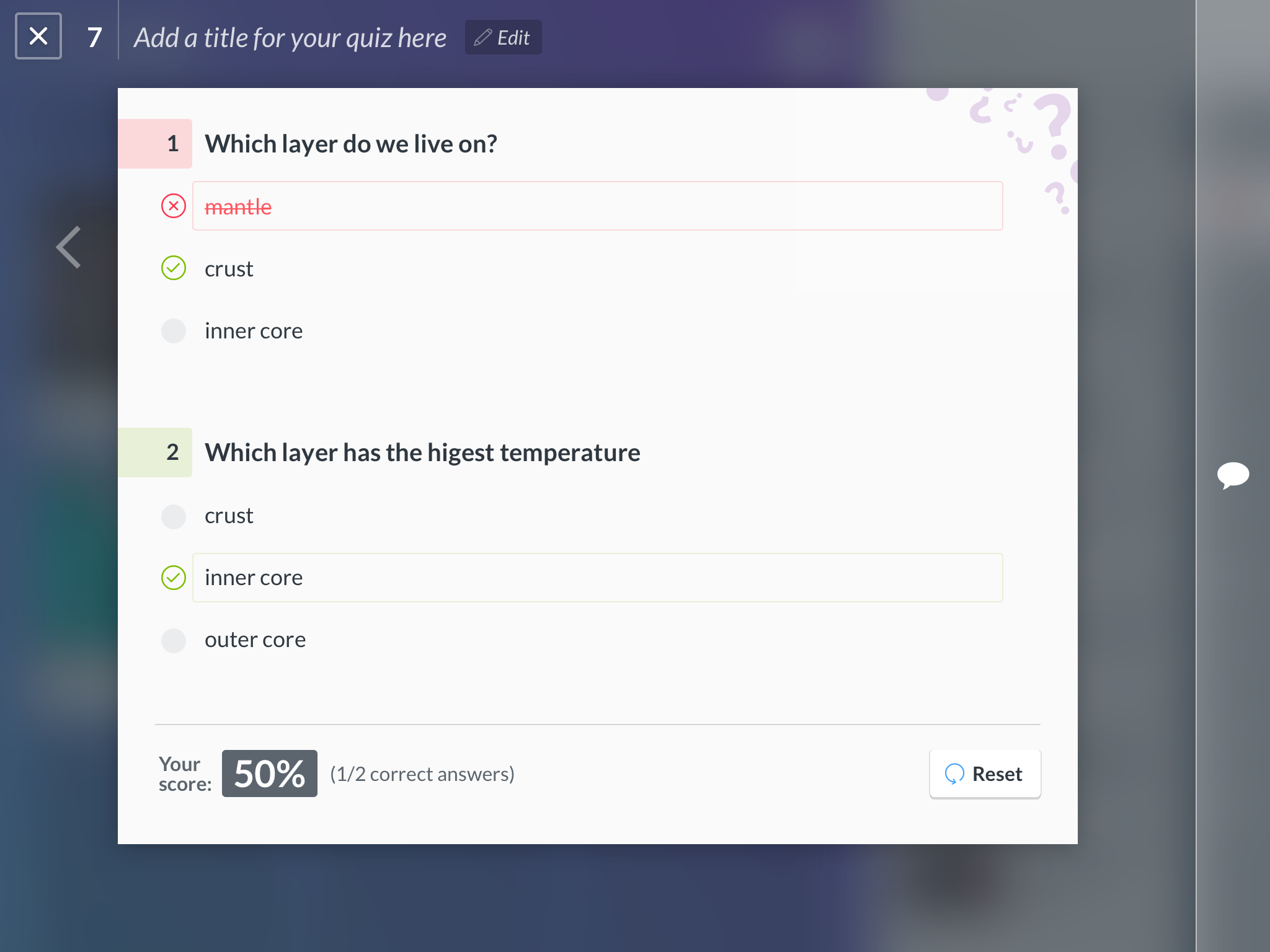
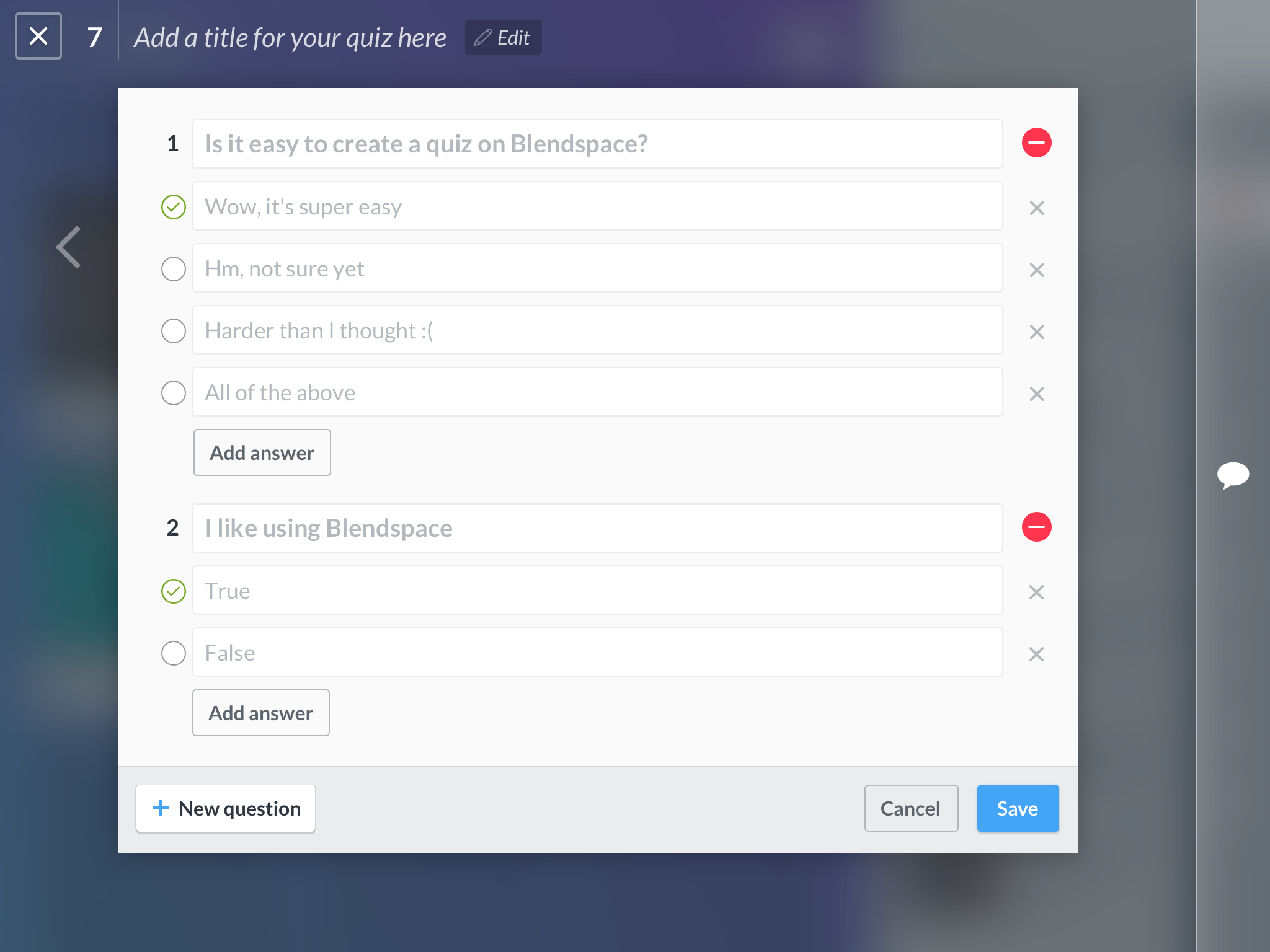
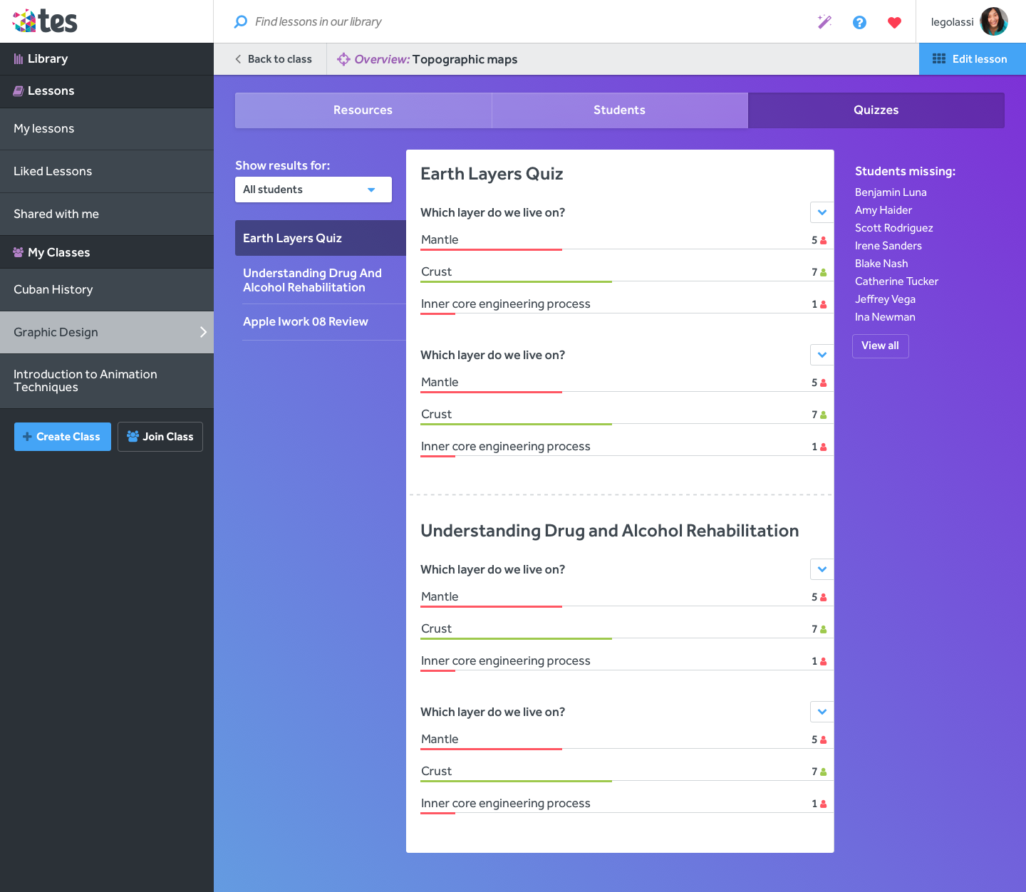
Quizzes
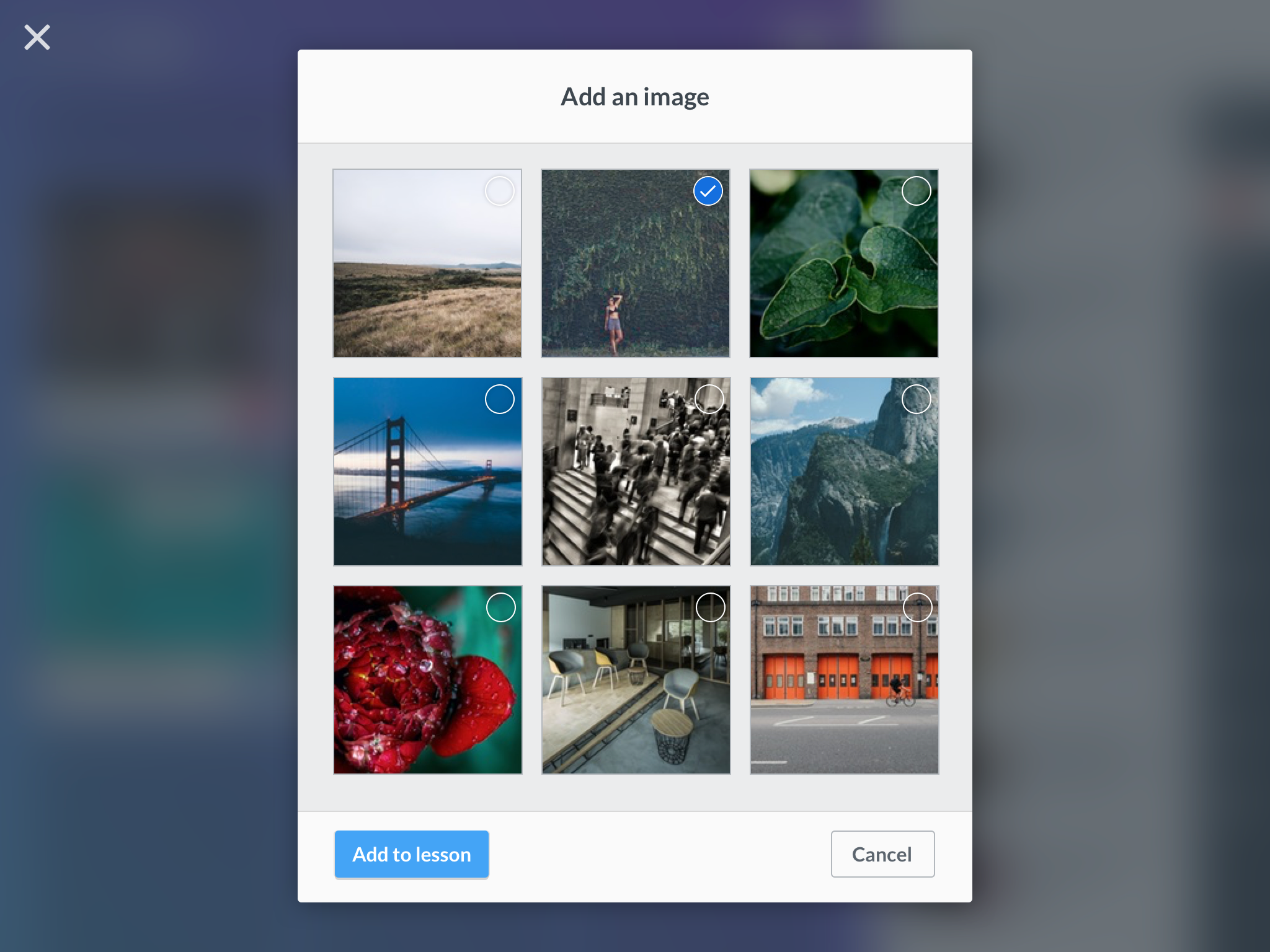
Illustrations
Like the web experience, illustrations would be part of the app to support and enhance the content and also to increase engagement from the students.
Wrapping up
After working on the rest of the screens I built a new, more polished prototype using inVision and went back to schools to test it obtaining great results. With some minor tweaks it would be ready for implementation.
Building the product
When you work many years with the same PM and engineers they learn a lot about design from our constant conversations. It’s great to have a team that care about details and works hard to deliver a high quality product.
Since I love doing front-end and working with React Native is very similar to the web. For this project I got my hands dirty and wrote a few lines to polish some elements of the app.
Ship it!
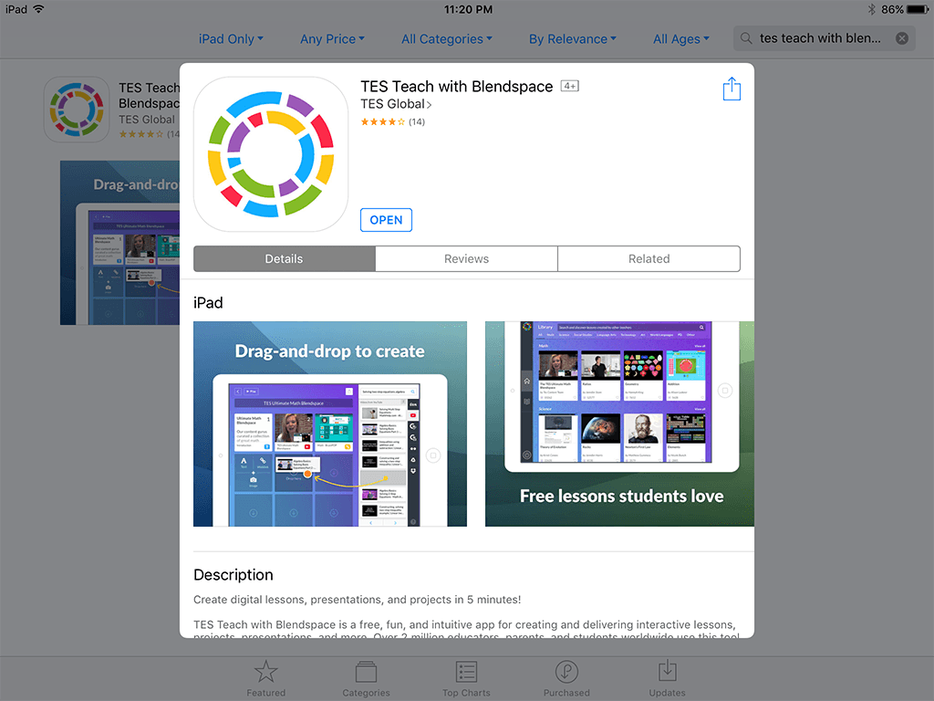
On August 5th and right on schedule, our app bitted the App Store. The feedback from our users was great:
I found Testeach really good and intuitive. Liked being able to sculpt questions so easily. Highly recommend it!
I am loving Blendspace for differentiating instruction. Students can do the assignments in the order they want & pace themselves.
Alucinando con la variedad de herramientas para crear recursos digitales... #TesTeach ¡merece mucho la pena!
The team was very happy with the results. Teachers and students love it and I can’t wait to see how this app develops with time and teachers find new and better ways to use Tes Teach.
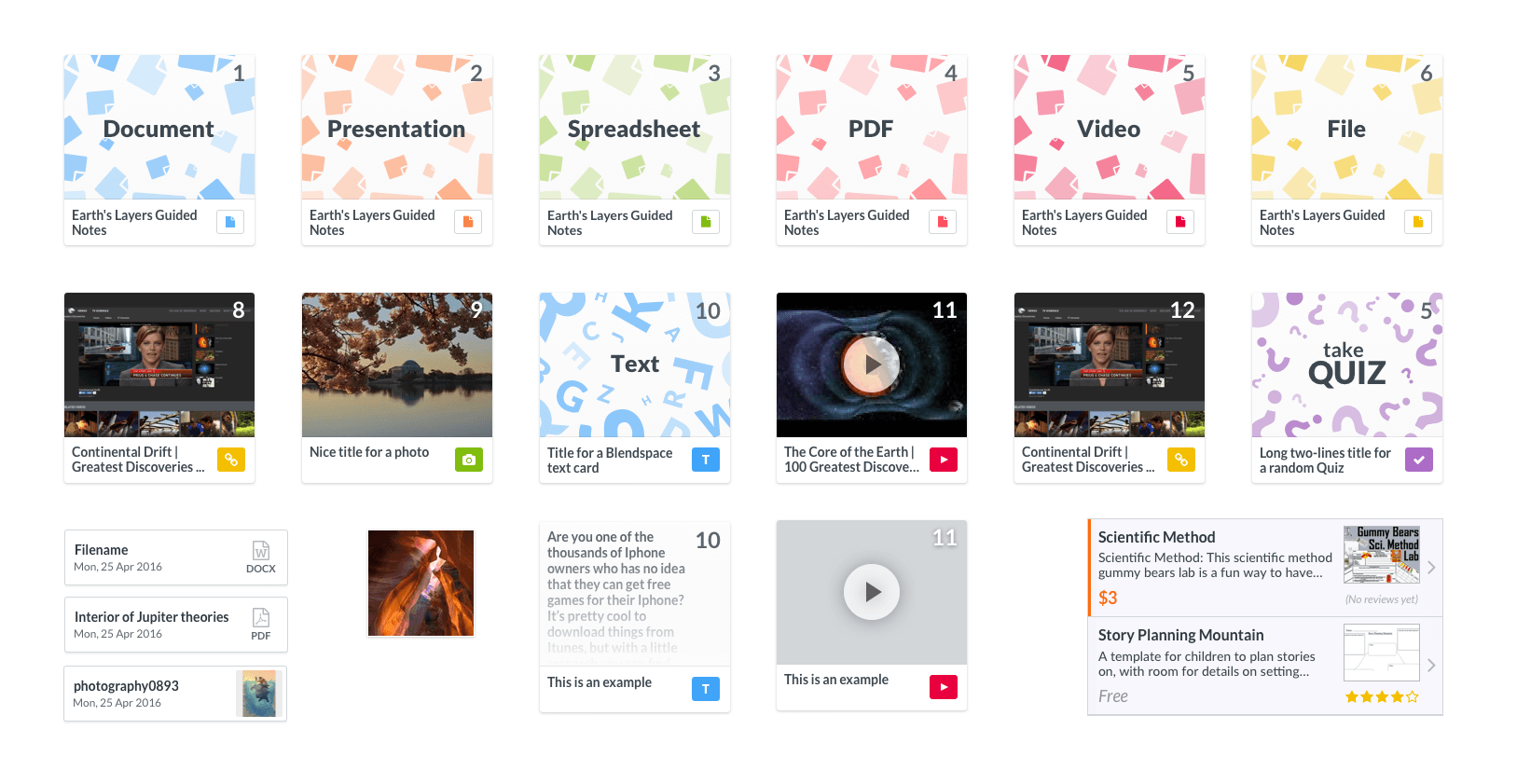
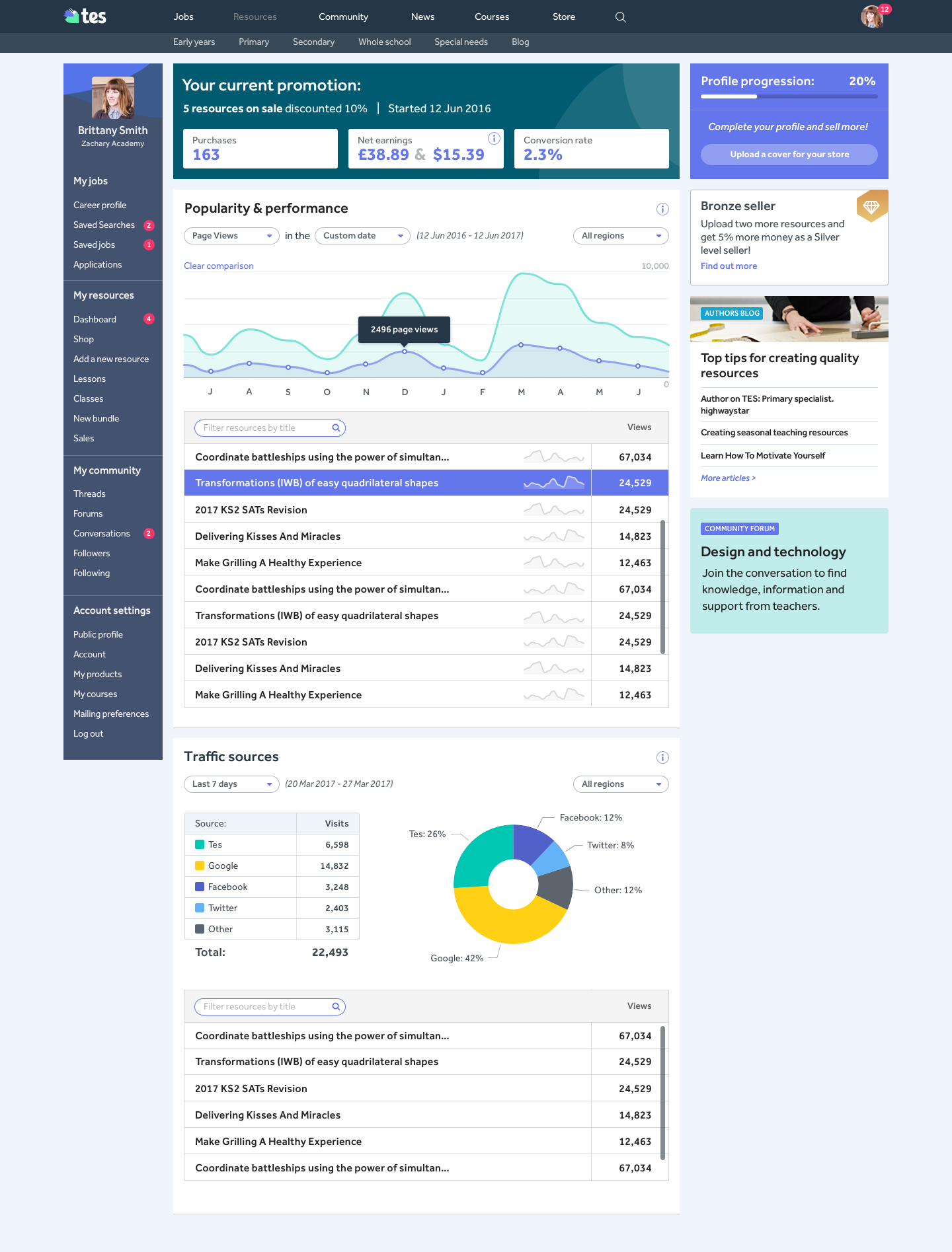
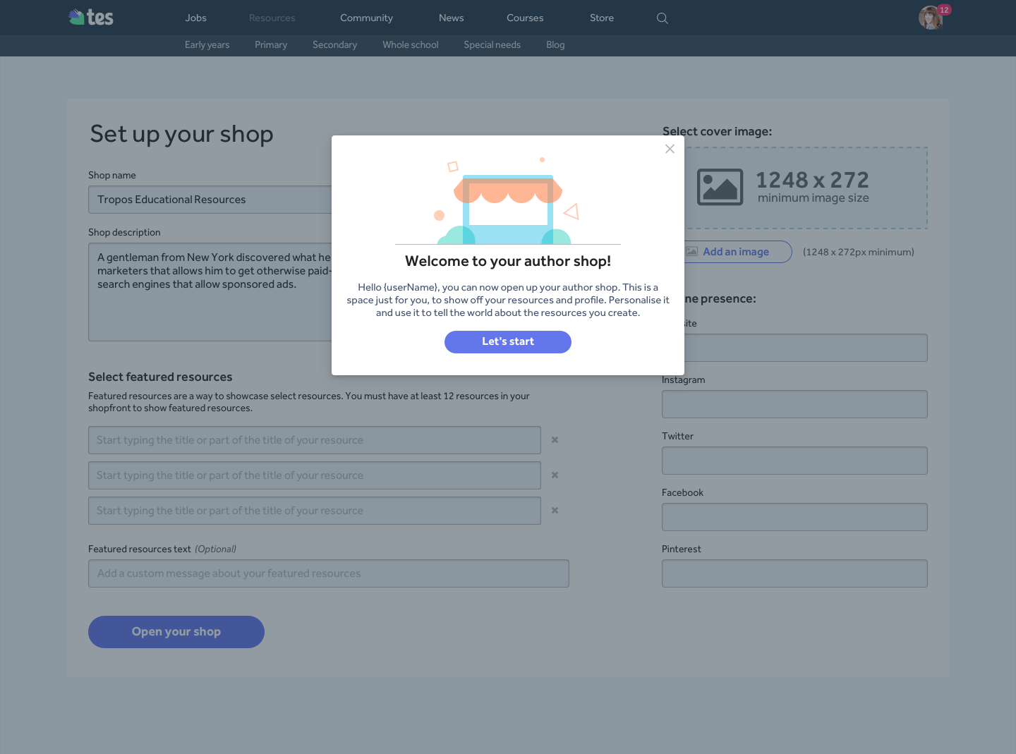
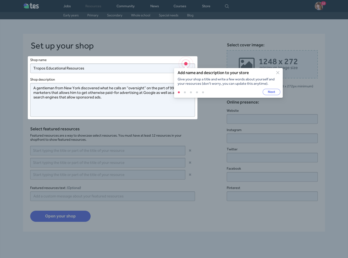
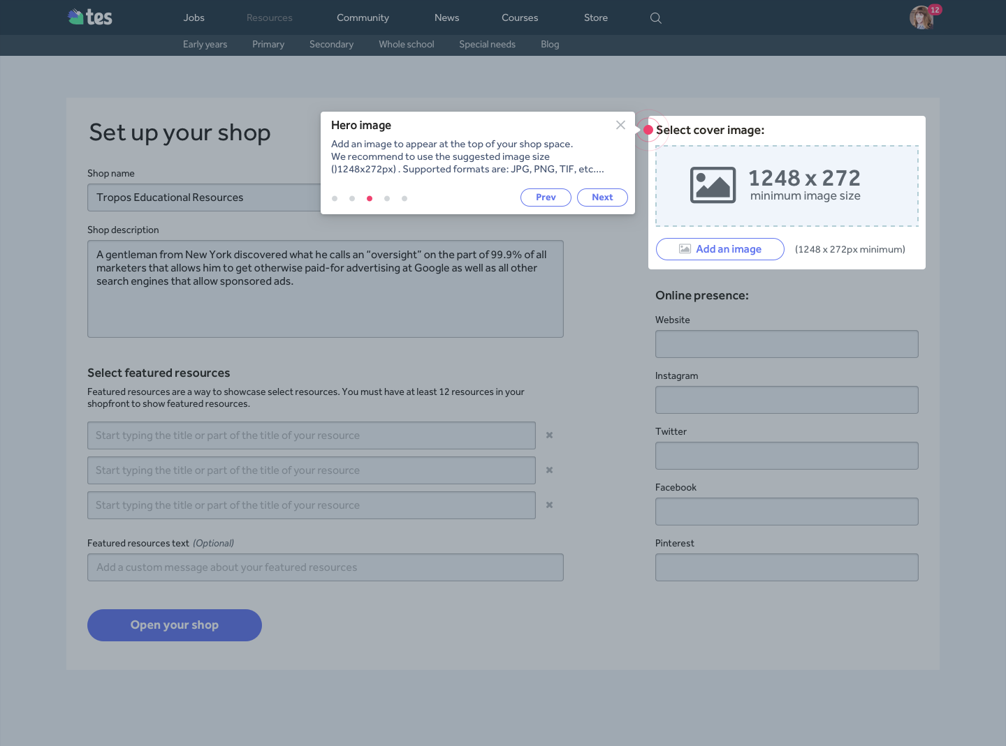
Global Resources marketplace
My role: Product Designer
Rest of the team (18 total):
- 2 Product Managers
- 8 Engineers
- 5 Marketers
- 2 Customer Support
- Another Product Designer
- + team support in London
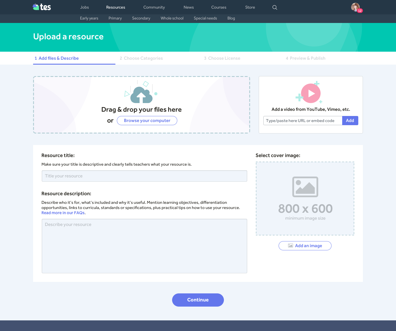
Notice: I'm currently working on this case study & It will be uploaded soon. For a preview take a look at a few of the project screens below or visit the marketplace.
The Tes Resources Marketplace helps teachers discover, share and sell teaching materials. Because of the amount of time teachers spend in the class there’s barely enough time to create lessons. Many teachers create high quality materials for their classrooms and Tes saw an opportunity here to help them share and/or sell them to other teachers for a low price to help them save precious time.

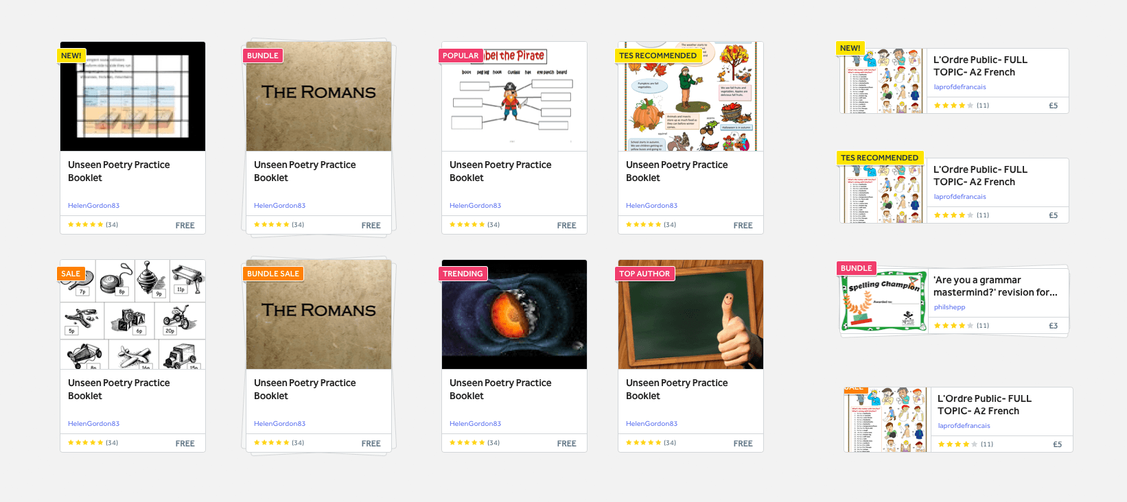
Blendspace / Tes Teach (Web)
My role: Only Product Designer
Rest of the team (11 total):
- 1 Product Manager
- 8 Engineers (3 in-house, 5 contractors)
- 2 Marketers
Notice: I'm currently working on this case study & It will be uploaded soon. For a preview take a look at a few of the project screens below or visit Tes Teach online.
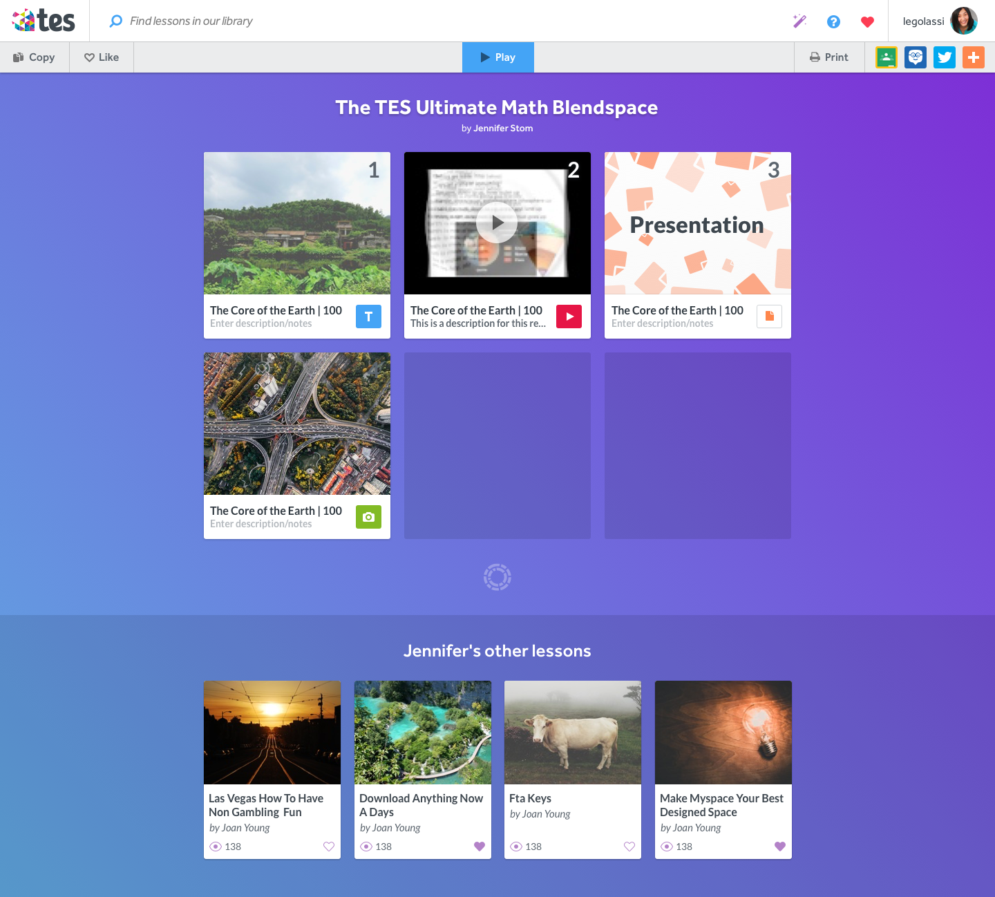
Blendspace / Tes Teach is a platform to create, build and share interactive lessons with students and teachers. When I joined the Blendspace team in 2013 they had an online product (Edcanvas) on a very early stage. After working on a premium product called Blendspace Next, we got acquired by Tes Global in 2014. I kept working on the app improving the experience by polishing and bringing new features, re-defining the visual style and integrating it with the Tes platform.
Older Projects
-
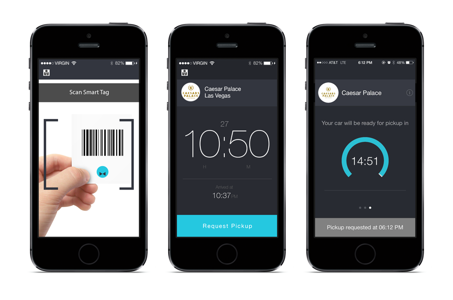
Smart Valet
×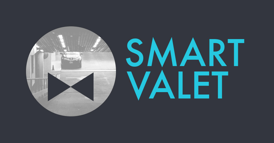
Smart Valet (iOS, 2014)
My role: Product Designer
Rest of the team: 1 Engineer (Gabriel Cebrian)
SmartValet was a side project I worked on with my friend and Blendspace developer/CTO Gabriel.
SmartValet is a mobile application for iPhone directed to improve the valet parking experience. Reducing the waiting time to receive your car and improving the payment system were the main issues we focused on.
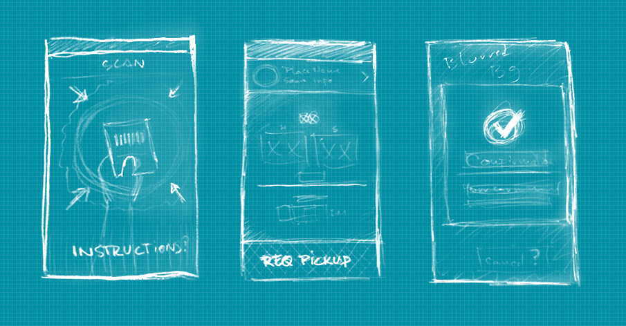
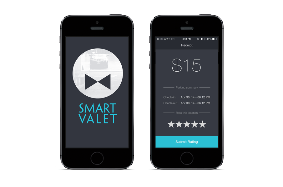 This app is still on development.
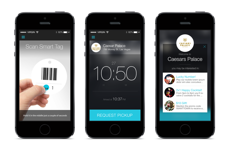
-
Visibrain
×
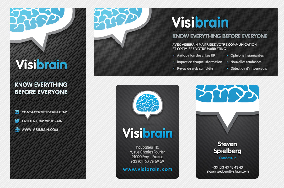
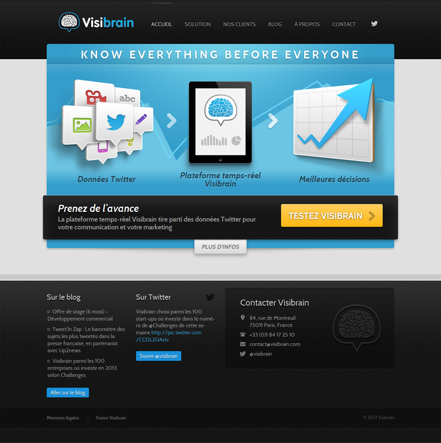
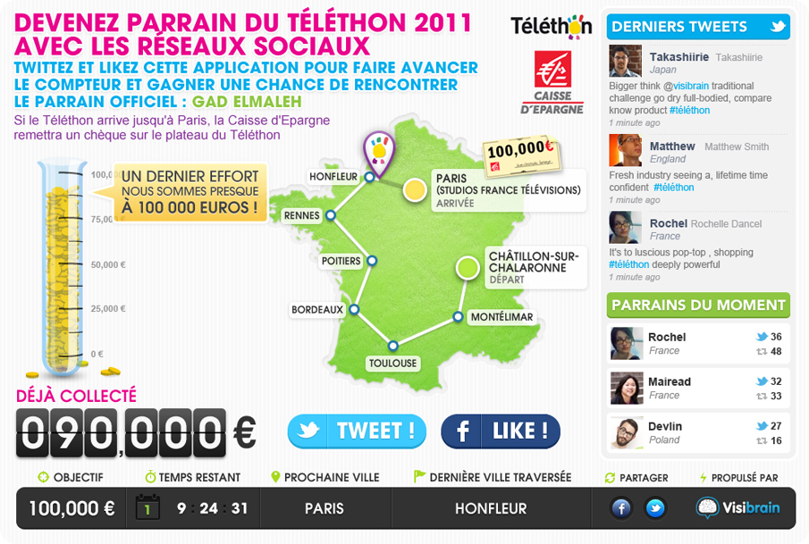
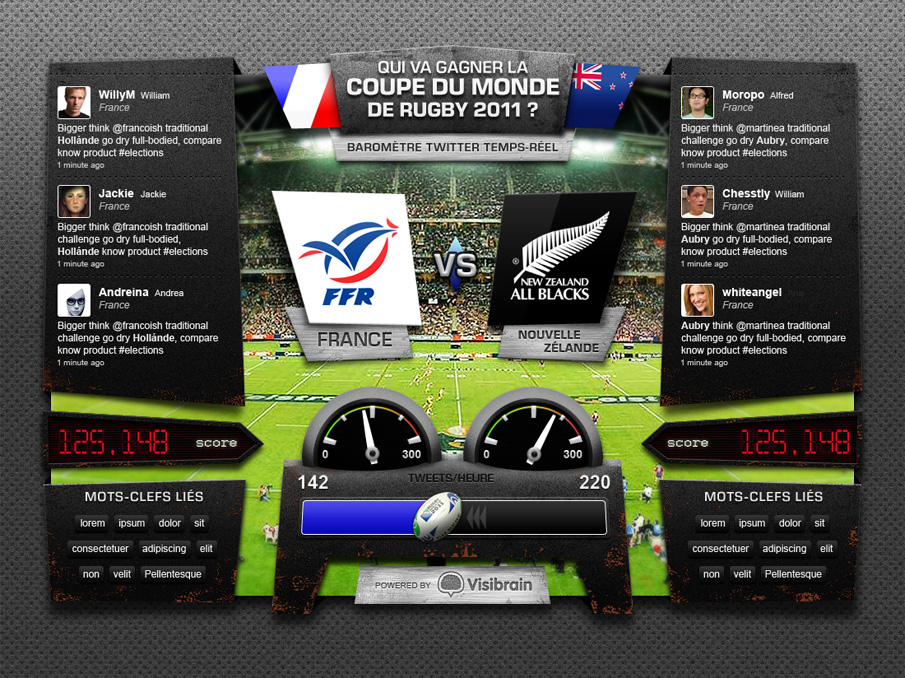
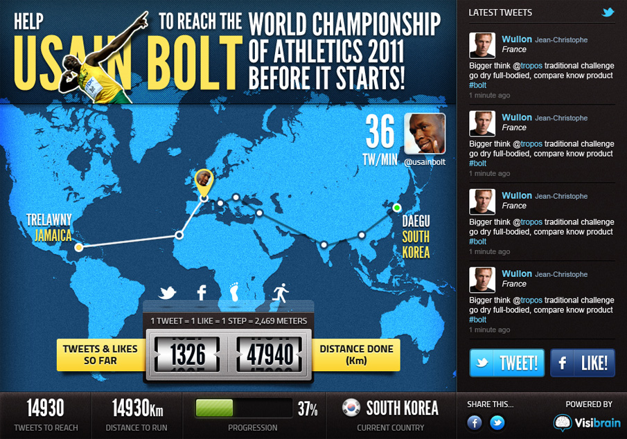
Visibrain (Web, 2013)
My role: Product Designer
Rest of the team: 3 Engineers
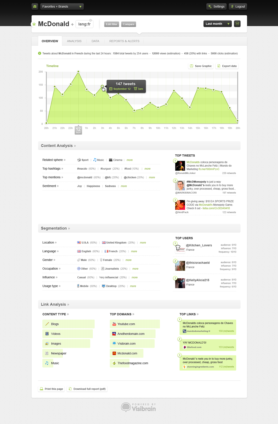
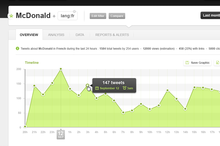
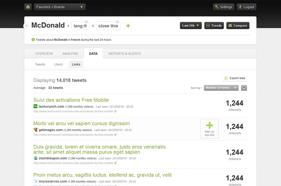
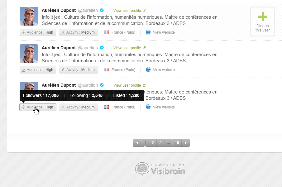
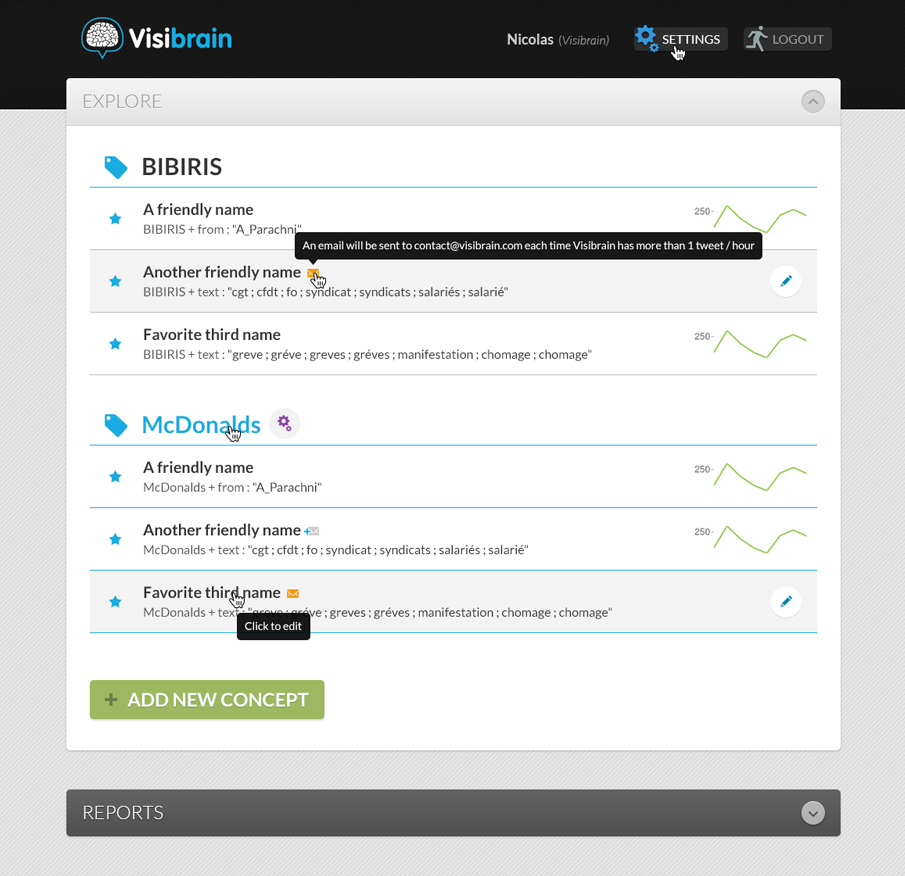
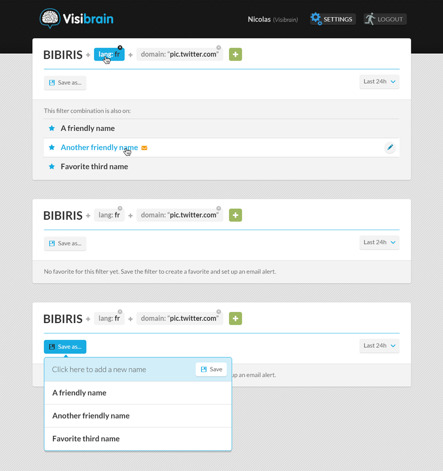
Visibrain is a realtime intelligence platform that harnesses the power of Twitter data for communication and marketing purposes. I joined the Visibrain team in 2011 remotely as their only Product Designer. As part of my work I created the Visibrain visual identity, designed their online app and created several marketing applications based on the Visibrain engine.
During my time with the team the company grew very fast and attracted big clients like BNP Paribas, Bouygues Telecom, PSA Peugeot Citroën, and the French Prime Minister team
-
Nutcache
×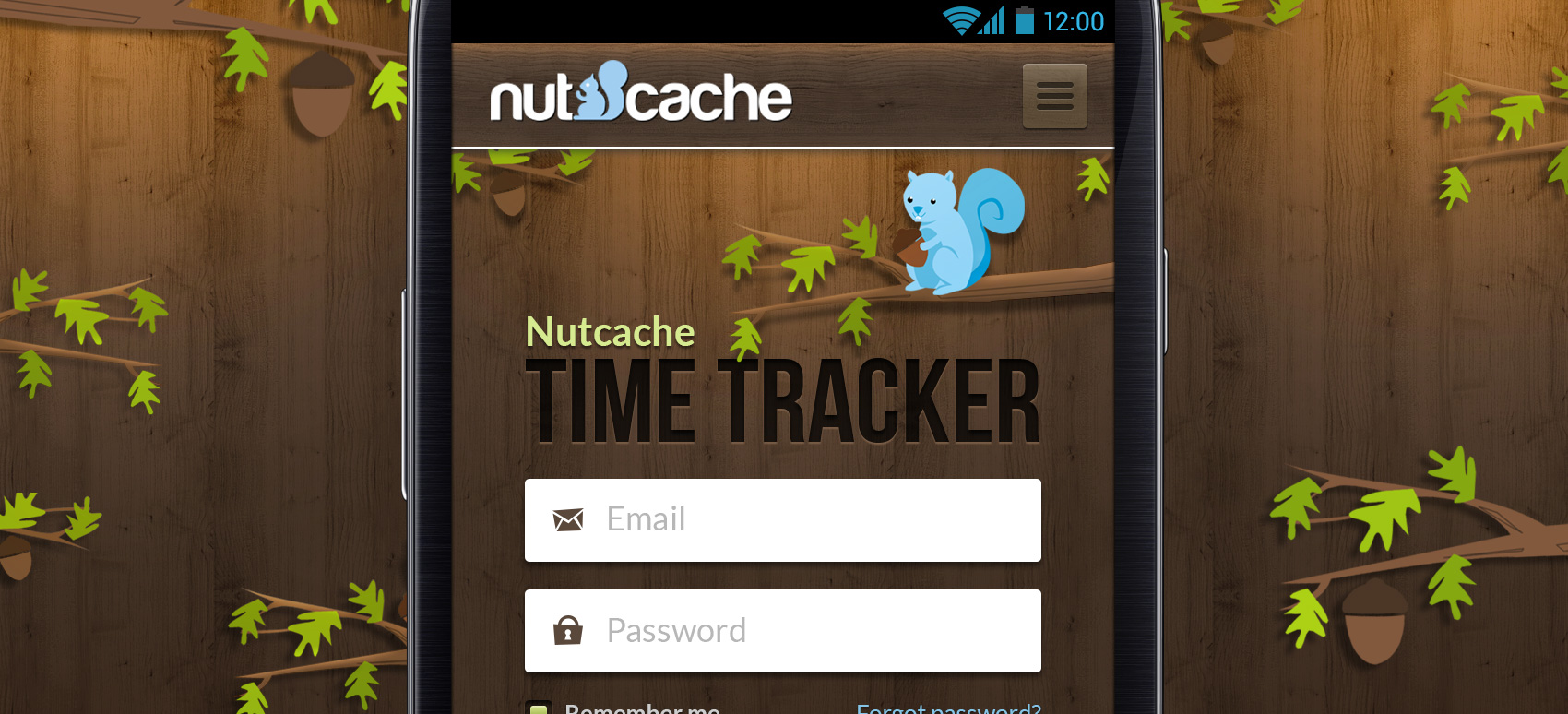
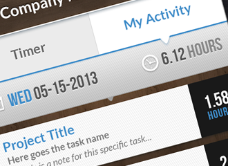
Nutcache (Android)
My role: Product Designer
Rest of the team: 3 Engineers
Nutcache is a time tracker application that I designed while freelancing. The user can create different profiles for each company he works with. The app has a complete system from time tracking to invoice creation. Dynacom Technologies approached me to create their mobile experience.
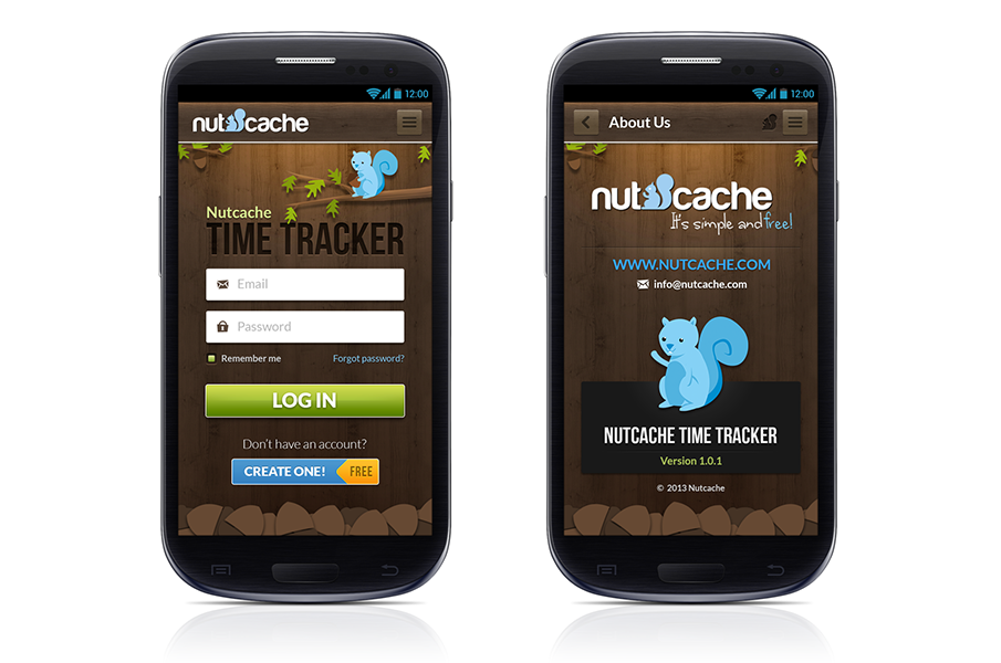
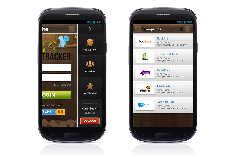
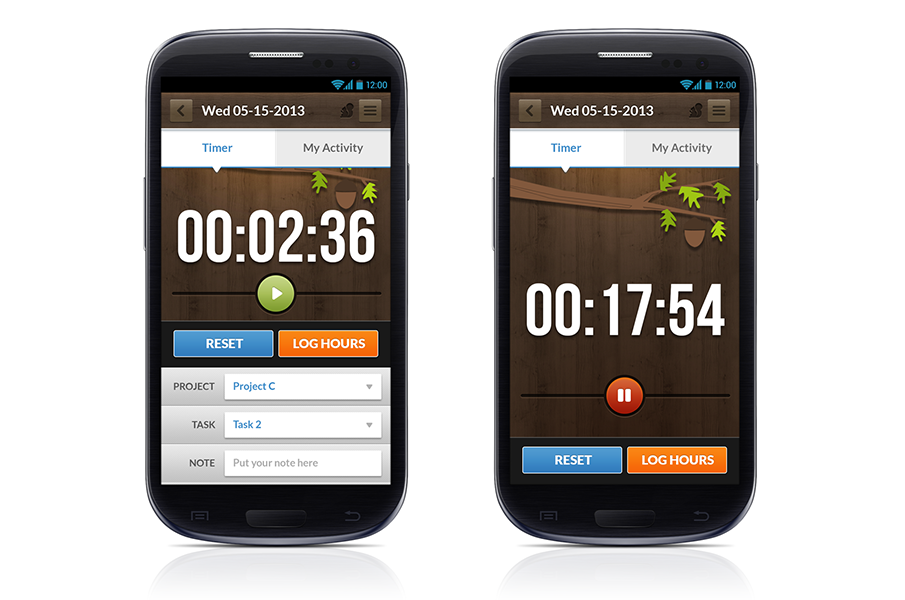
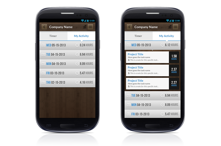 These are the current designs. This app is still on development.
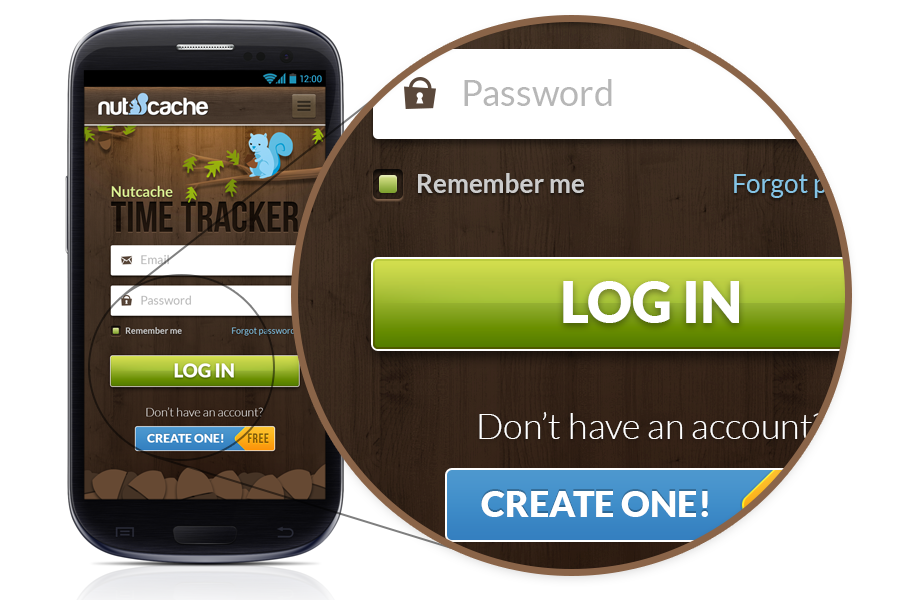
-
Legado Cubano
×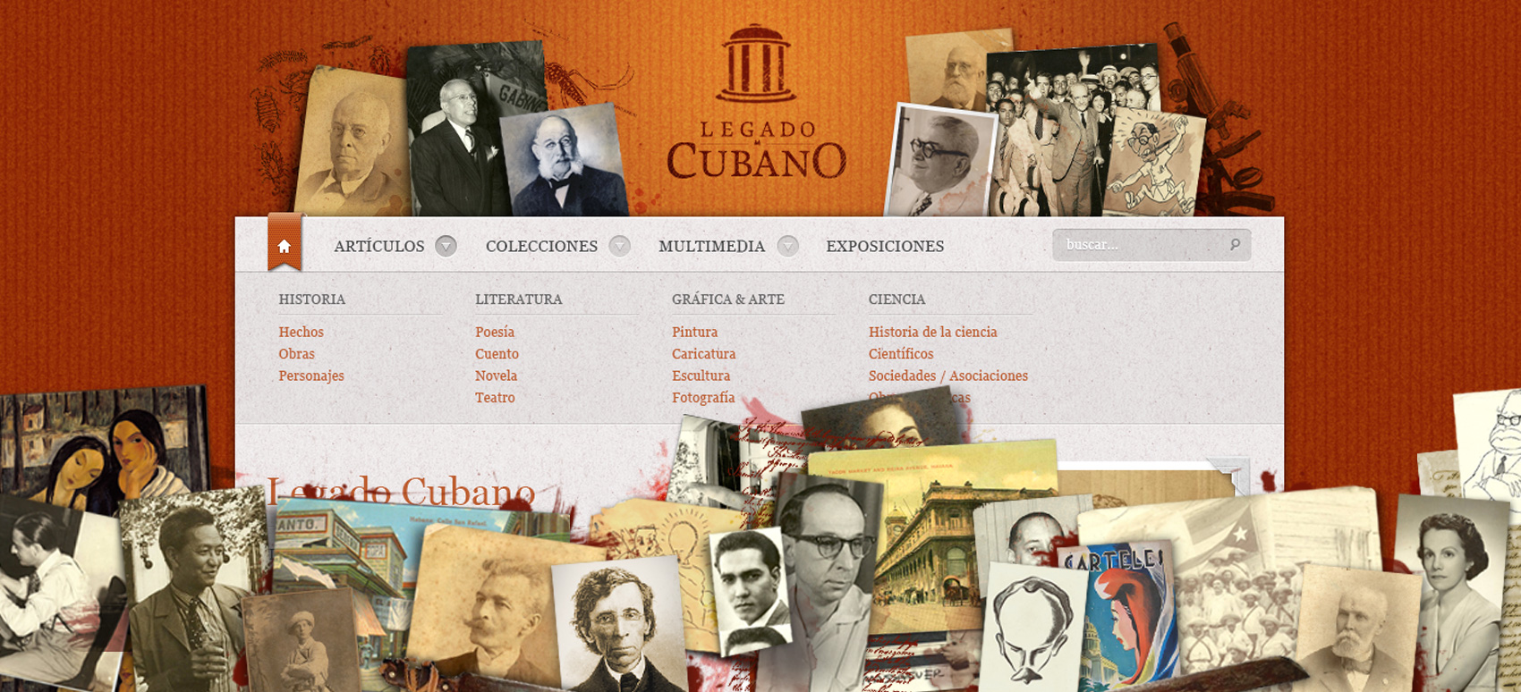
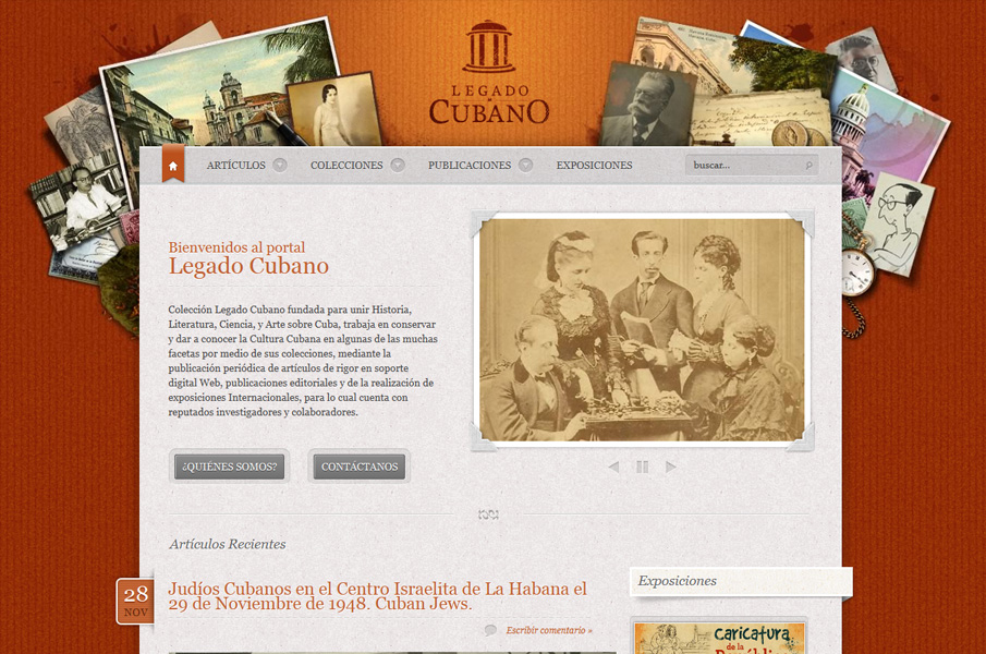
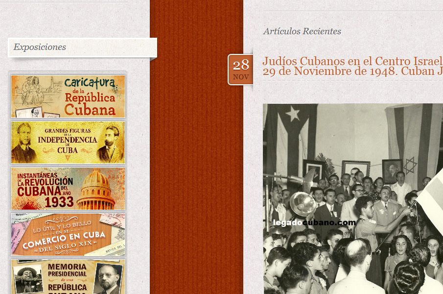
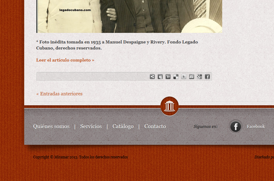
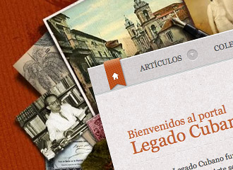
Legado Cubano (Web, 2012)
My role: Web Designer
Legado Cubano (Cuban Legacy) was a project focused on preserving and disseminate the Cuban culture through collections exhibitions, proffesional articles, book publications and International expositions. My work was to create their online presence and the visual identity.